
Stories
Stories are one of two primary formats for presenting your data in Data Stories. They provide a dynamic, slide-based approach to data visualization that allows you to showcase multiple views or angles of your data sequentially.
Each slide or section in a story has its own 8 x 12 grid canvas.
This guide describes how to create interactive stories using slides with visualizations and static widgets.
Create a story
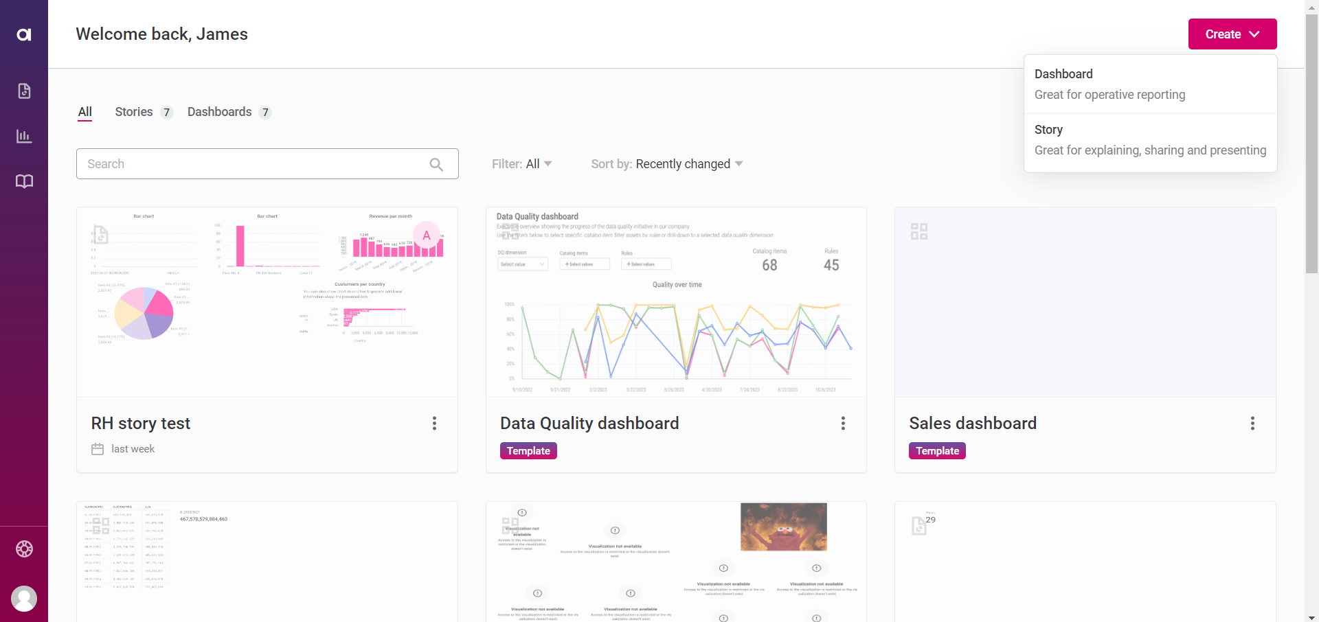
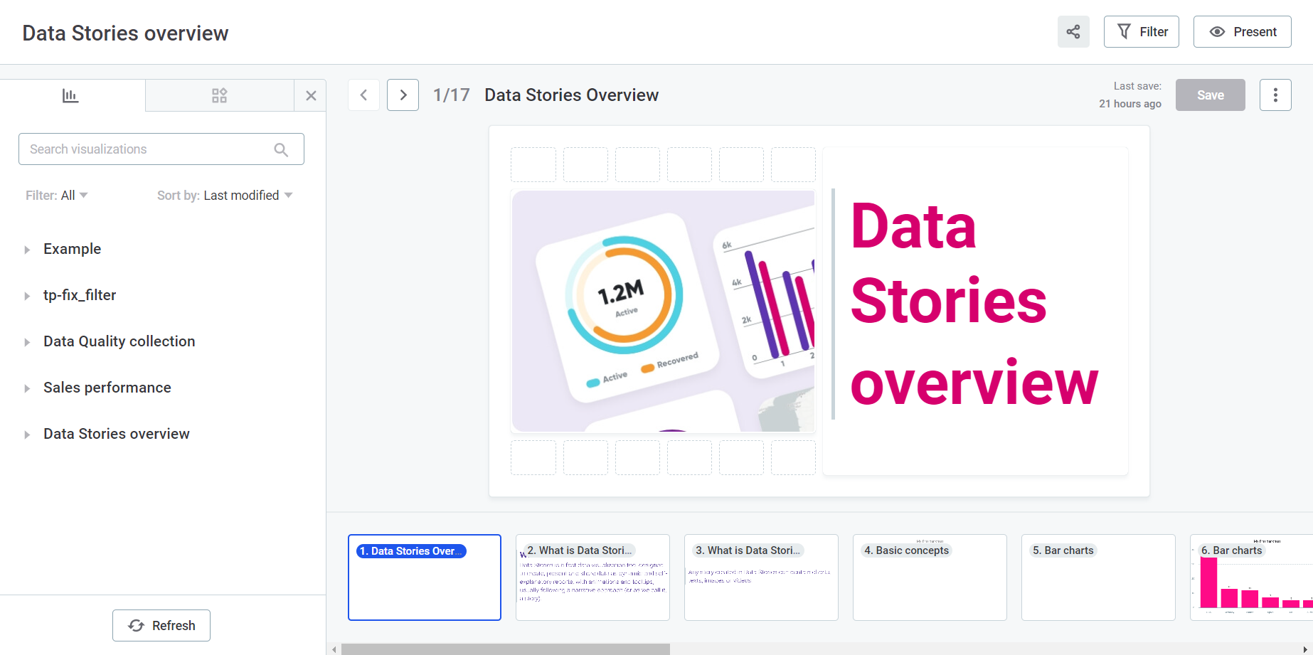
On the Data Stories home page (or on the Reports tab, accessible from the left-hand navigation), select Create > Story.
This opens a new story with a single, empty slide, and a resizable left-side menu with two tabs: Collections and Widgets.
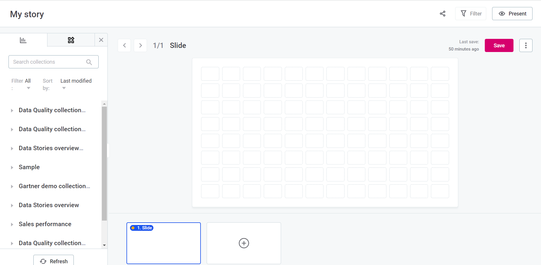
| By default, a new story is named My story. You can rename it by double-clicking the title and entering your preferred name. |
|
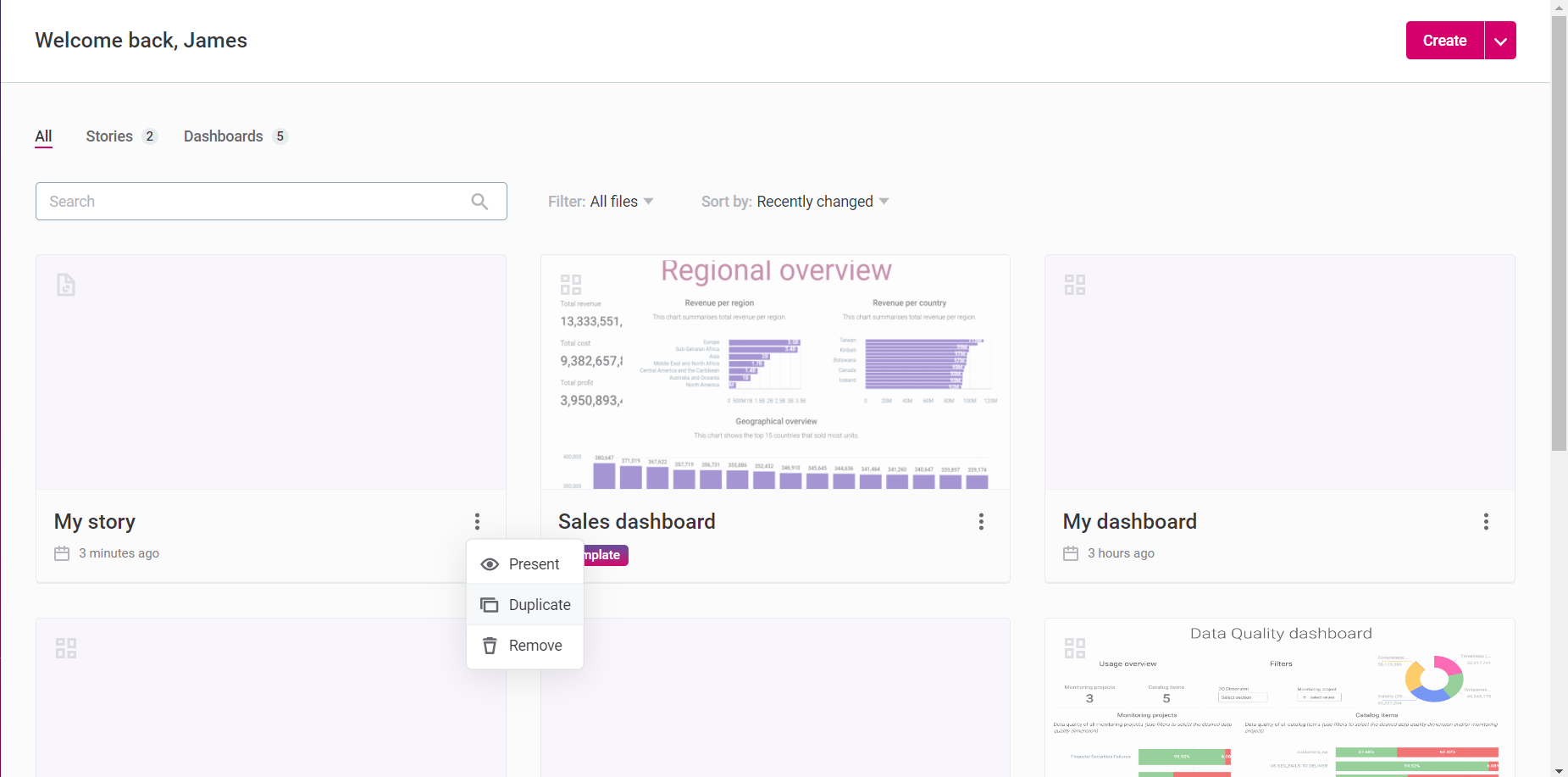
Open and work in an existing story by clicking the relevant card on the Data Stories home page or on the Reports screen. To duplicate an existing story, either from the home page or the Reports tab:
|
Build your story
Stories allow you to add visualizations and static widgets to each slide or section, just like dashboards.
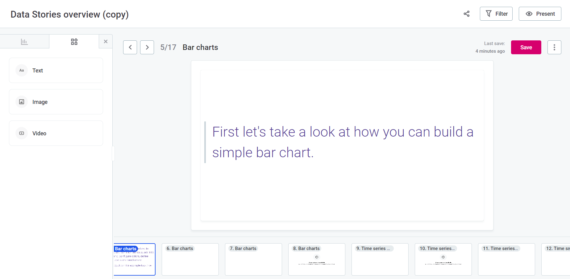
Add and manage slides
-
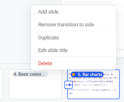
Select the three dots menu of the current slide (either in the slide sequence or on the slide canvas) and select Add slide.
Each slide is its own canvas that you can further customize.
-
From the three dots menu, you can also duplicate, rename, or delete the slide. You can slide-in horizontally as well.
| Like the story title, slides can be renamed by double-clicking their title and entering your preferred name. |
Transitions
By default, slides transition vertically. The Slide-in horizontally option makes slides move horizontally rather than vertically in the Presentation or View mode.
This can be set individually for each slide. Open the three dots menu of the current slide and select Slide-in horizontally. A slide with a side transition displays an arrow on its left side in the builder.
To remove the transition, in the three dots menu select Remove transition to side.
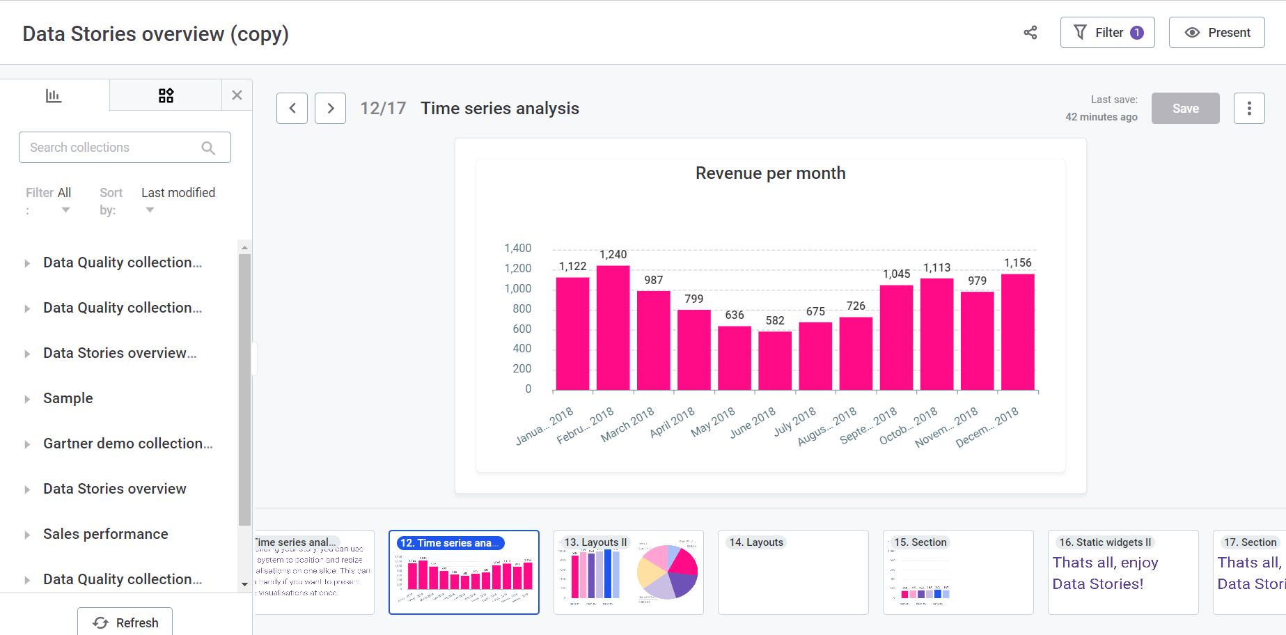
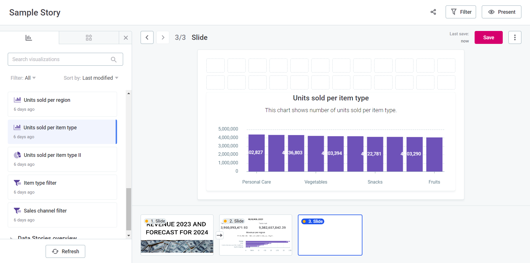
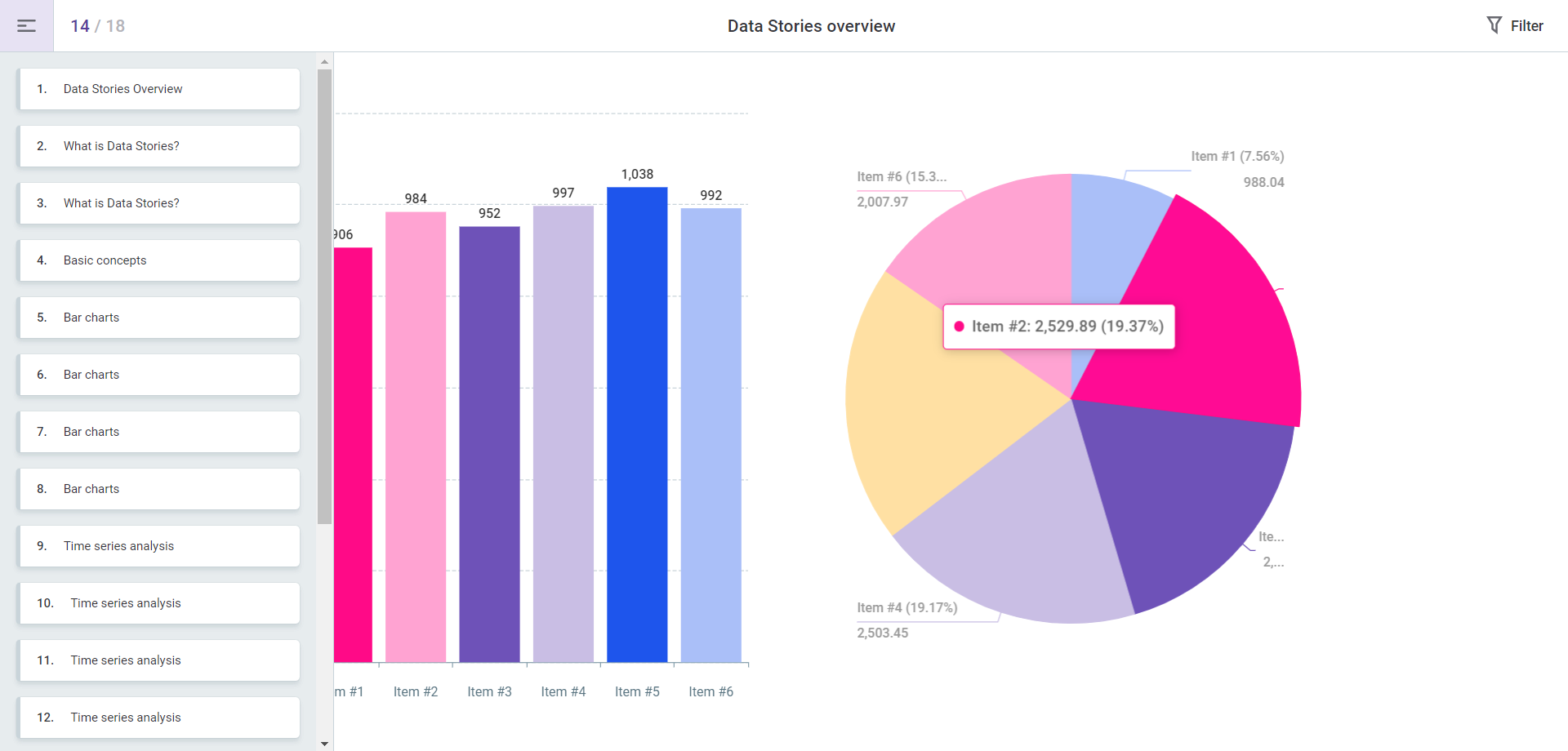
Add and manage visualizations
You can add multiple visualizations to your story, even from different collections. For maximum impact, try to place the most important widgets at the top or in the center.
| From 15.3.0, Data Stories leverages data protection classification that prevents unauthorized access to protected data, as signaled by visual indicators (lock icons) and notifications. For more information, see Data Protection Classification in Data Stories. |
-
On the Collections tab, select the collection where your visualizations are stored.
-
The collection displays a dropdown list of all visualizations it contains.
-
Drag and drop your visualizations to the grid of your slide.
-
Resize or rearrange the visualizations by dragging the corners or the whole visualizations within the grid.
-
|
To delete a visualization, select the trash icon in the upper-right corner of the widget. To edit a visualization, select the pencil icon. This opens the visualization builder for your chart. Make changes as necessary and select Save. To learn more about visualizations and the Visualization Builder, see Visualizations. |
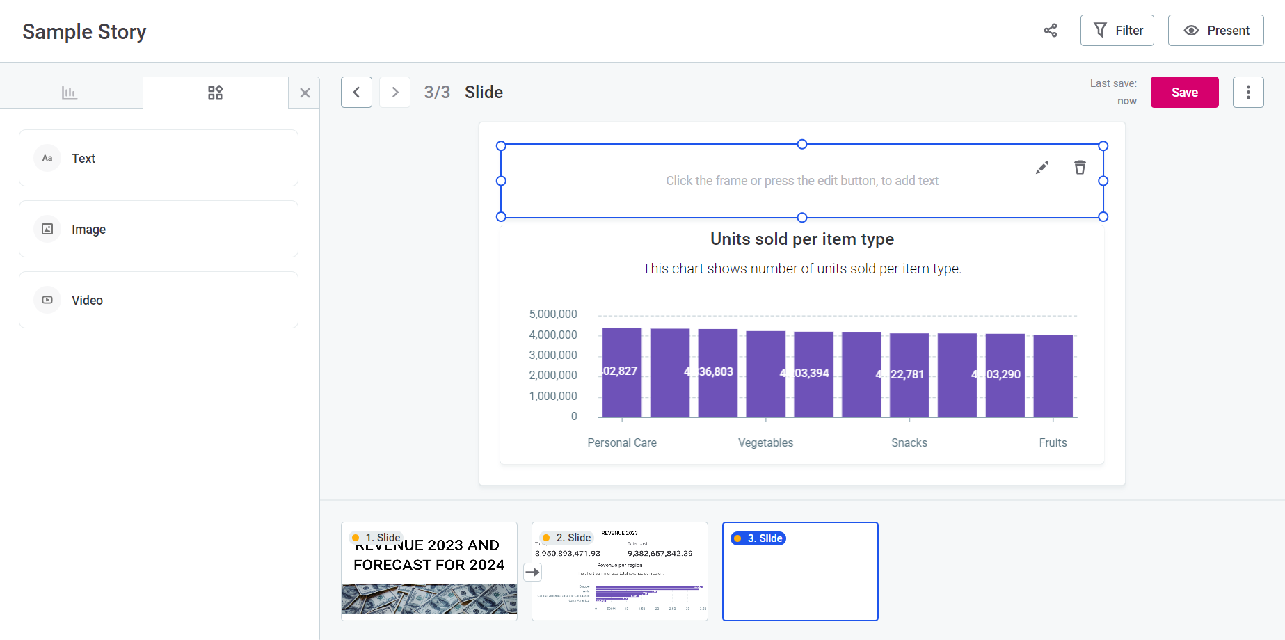
Add and manage static widgets
Use static widgets, such as video, image, or text elements, to enrich your story. You can add them by selecting the Widgets tab in the left-side menu, and dragging and dropping the relevant widget to your story.
Once you add the widget to the story, you can customize certain properties.
|
To delete a static widget, select the trash icon in the upper-right corner of the widget. To edit it, select the pencil icon next and make changes as necessary. |
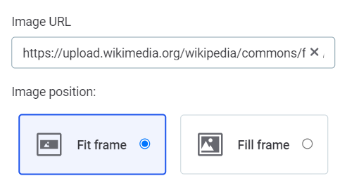
Image widgets
Provide the Image URL.
You can also adjust the image display by selecting either Fill content or Fit content in Image position.
Text widgets
Select the widget to access formatting and customization tools.
| Hovering over any button in the toolbar to view helpful tooltips. |
The following options are available:
-
Text style: Choose from options including Title, Headline, Paragraph, or Small text.
-
Text color: Choose your preferred color from the grid.
-
Text alignment: Select text alignment (left, right, center, or justified).
-
Rich Text Options: Apply bold, italic, or underline formatting for emphasis.
-
Hyperlink: Highlight the desired text and paste the relevant URL into the field that appears to create a hyperlink.
-
Image URL: Embed images within your text using this field.
-
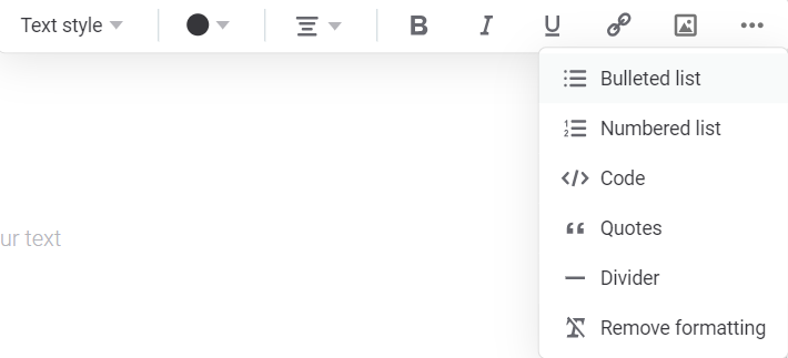
Additional options (…): This opens further choices:
-
List style: Display your text as a bulleted or numbered list.
-
Code: Creates a code block for the text.
-
Quotes: Forms a quotation block for the text.
-
Divider: Inserts a horizontal rule.
-
Remove formatting: Clears all formatting from the selected text.
-
-
Undo: Reverses the previous typing or formatting action.
-
Redo: Restores the most recent reversed action.
Apply global filters
Apply global filters to your story to control the data displayed on the slides.
| Filters set on this screen apply to your entire story. To define filters that apply only at the level of a specific chart or visualization, see Visualization Filters. |
Select data source and attributes
-
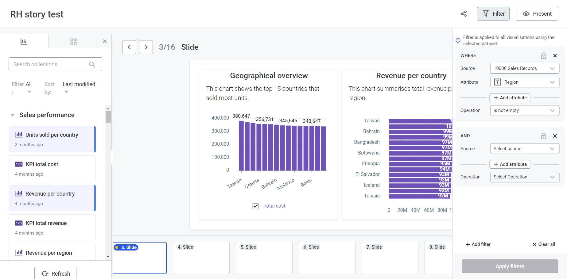
Select Filter in the upper-right corner of the screen.
-
In Source, choose a dataset from the available datasets in your story.
-
In Attribute, choose an attribute from the list. Recommended attributes (usually dimensions and metrics utilized in your chart) are displayed first.
Add more attributes as needed.
Specify the operation
In Operation, select an operation based on the data type of the chosen attribute: Numeric, Text, and Date.
The full list is as follows:
-
Numeric
-
Text
-
Date
-
>: Data from the selected column is displayed if it is greater than the value entered.
-
< : Data from the selected column is displayed if it is less than the value entered.
-
>=: Data from the selected column is displayed if it is greater than or the same as the value entered.
-
<=: Data from the selected column is displayed if it is less than or the same as the value entered.
-
=: Data from the selected column is displayed only if it matches the value entered.
-
≠ : data from the selected column is not displayed if it matches the value entered.
-
is empty: Data from the selected column is displayed if the cells have NULL values (no data).
-
is not empty: Data from the selected column is displayed if the cells do not have NULL values (data).
-
in range: Data from the selected column is displayed if it is in the range entered.
-
not in range: Data from the selected column is displayed if it is not in the range entered.
-
equal to: Data from the selected column is displayed only if it matches the value entered.
-
not equal to: Data from the selected column is not displayed if it matches the value entered.
-
contains: Only applicable to text (strings). Data from the selected column is displayed if it matches the text specified in the filter.
-
does not contain: Only applicable to text (strings). Data from the selected column is displayed if it doesn’t match the text specified in the filter.
-
is empty: Data from the selected column is displayed if the cells have NULL values (no data).
-
is not empty: Data from the selected column is displayed if the cells do not have NULL values (data).
-
equal to: Data from the selected column is displayed only if it matches the date entered.
-
not equal to: Data from the selected column is not displayed if it matches the date entered.
-
in range: Data from the selected column is displayed if it falls within the selected time period range.
-
not in range: Data from the selected column is displayed if it falls outside the selected time period range.
-
before: Data from the selected column is displayed only if the date registered occurred before the chosen date.
-
after: Data from the selected column is displayed only if the date registered occurred after the chosen date.
-
is empty: Data from the selected column is displayed if the cells have NULL values (no data).
-
is not empty: Data from the selected column is displayed if the cells do not have NULL values (data).
-
in last: Data from the selected column is displayed only if it falls within the last time frame chosen by the user and its unit: Days, Weeks, Quarters, Months, Years.
-
in current: Data from the selected column is displayed only if it falls within the current time period chosen by the user: Day, Week (Sun-Sat), Week (Mon-Sun), Month, or Year.
Enter values
Here, the steps diverge depending on the type of attribute and operation chosen.
Numeric attributes
-
Simple Comparisons (
>,<,>=,⇐,=,≠): An additional input field appears where you can enter a numerical value. Use the plus and minus icons to increase or decrease the value by one unit. -
No Data (is empty, is not empty): No additional input field appears as these filters validate cells based on the presence or absence of NULL values.
-
Range (in range, not in range): Two adjacent input fields appear where you need to enter the lower and upper limits of the range.
Text attributes
-
No Data (is empty, is not empty): No additional input field appears as these filters validate cells based on the presence or absence of NULL values.
-
Text Entry: An input field appears. Select Add items to provide the specific text values you want to filter by.
Initially, the menu shows a limited set of recommended values at the top. Choose from this list or use search to find the desired values. The search is case-sensitive.
By default, the search only looks in the recommended results. To broaden the search to all column values, select Search in all column values. -
Wildcard Search (contains, does not contain): You can add a percentage sign (
%) before or after the text. This restricts the results to show only the ones that either finish or start (respectively) with the expression indicated.For example,
%sshows the results that end with-s, ands%shows the results that start withs-.
Date attributes
-
Specific Date (equal to, not equal to, before, after): A single input field appears. Click it to open a calendar and select the date.
-
No Data (is empty, is not empty): No additional input fields are required.
-
Date Range (in range, not in range): Two fields appear for entering the start and end dates.
-
Relative Date (in last): Two adjacent fields appear, one for entering the number of periods and the other for choosing the type of period (Days, Weeks, Quarters, Months, Years).
-
Current Period (in current): A field appears for specifying the current time period: Day, Week (Sun-Sat), Week (Mon-Sun), Month, Year.
Apply filters
-
Select Apply filters so your filters are reflected in the story.
-
To add more filters, select Add filter and repeat the previous steps.
-
To remove all filters, select Clear all.
|
For each filter, you can perform some additional actions:
|
View your story
Once you’ve customized your story, select Present in the upper-right corner of the screen. Your story shifts to a read-only, refined view, complete with a left-side navigation menu—ideal for public presentations or personal review.
|
When you select Present, you enter the View mode. If you plan to share a link to this story, remember that other users can only view it if certain conditions are met. For details, see Share your story. |
Save your story
Once you’ve customized your story, select Save. This saves all your updates for the current slide, but remember that each slide has to be saved independently.
| The last saved timestamp is shown to the left of the Save option. |
|
To keep track of your story slides' versions, use the three dots menu and select Version history. Here you can view change logs, restore the slide to a previous version, or save a specific version as a new slide. 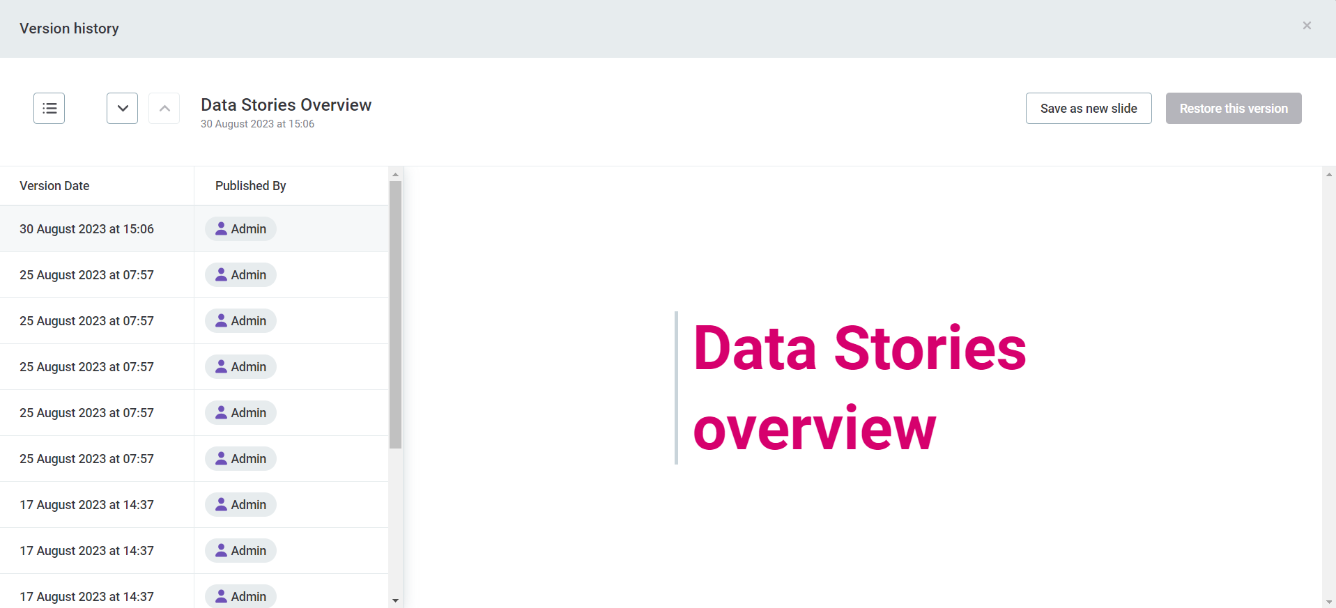
|
Share your story
After saving, your story is ready for viewing and you can also share it with others.
|
If you plan to share a link to this story, remember that other users cannot view it unless:
|
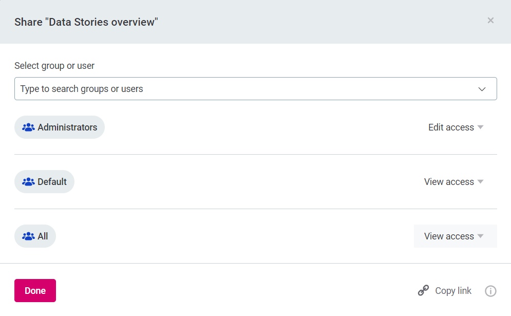
To share a story:
-
Select Share.
-
Edit Share story settings:
-
Find and select the Users or Groups you want to share the story with.
-
Select the appropriate access level (Edit or View) for each user. You can also remove existing access rights from this same menu.
-
Select Copy Link to copy the story URL to your clipboard. You can then paste this URL into an email, chat, or any other communication channel to share it directly.
-
-
Once you have selected the relevant users or groups and set up their access levels, select Done. Your coworkers can now view or edit your story.
Was this page useful?