
Entity Screen Customization
In addition to customizing the Left Navigation Menu, you can also configure how entities are displayed on the dedicated listing page (entity).
Overview
| Only power users can change these settings. Once saved, changes are applied immediately and propagated to all users. |
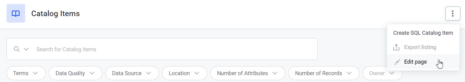
To configure an entity screen, navigate to the tab with which you want to work. In the three dots menu, select Edit page. This is shown on all listings, custom screens, and detail screens.
Depending on the screen type, the following configuration options are available:
-
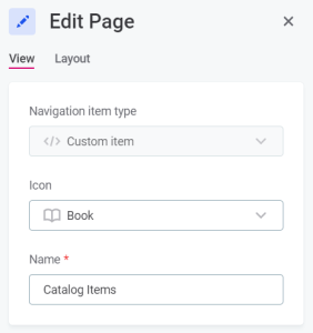
View: Change the tab name or icon. This can also be done from the Global Settings > Navigation tab (Edit option in the three dots menu).
Available on listings and custom screens.
-
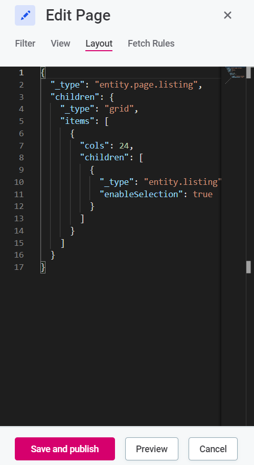
Layout: Manage page widgets and customize how the page is rendered. Modifying the page layout does not affect the metadata model but only how widgets are shown in the application.
Available on all screens where the screen settings can be edited. For more information, see Layout.
-
Fetch Rules: Filter entities based on the pattern provided.
Available only on listings with preconfigured fetch rules.
-
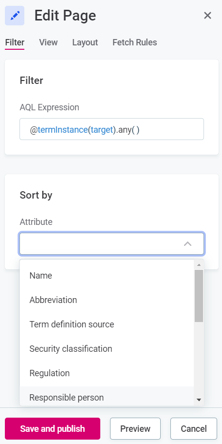
Filter: A user-friendly way of defining the fetch rule for filtering or sorting. You can define the AQL expression that you want to use and select by which attribute the listing is sorted.
Available only on listings with preconfigured fetch rules. For more information about AQL search, see Search.
| Any changes you make must be saved (Save and publish) before you switch to another tab, otherwise they are discarded. To visualize the new screen layout before publishing the changes, use the Preview option. |
| View all customized layouts on the Custom Layouts tab in Global Settings. Here you can also track and manage changes made to customized layouts in the last upgrade. For more information, see [Custom Layouts]. |
Layout
The Layout option lets you customize widgets, which in turn defines how the page is rendered. For each screen, there is a default layout in place that ensures that all node properties are placed on the screen using smart widgets. Specific layouts are preconfigured for a number of key objects from the default metadata model, such as catalog items, terms, rules.
Changing the layout when editing a screen can override both the default and specific layouts. This affects only how widgets are shown, not the metadata model itself.
The following table provides an overview of the terms used to configure the screen layout. The layout is defined in JSON format and the configuration must not contain any syntax errors.
| Name | Example | Description |
|---|---|---|
card |
|
A card refers to a single white box on the screen. The card widget is used to group multiple smaller properties (or, more precisely, their respective widgets). 
|
entity.property |
Inline object: 
Specific implementation: 
|
Identifies widgets with the least granularity, which places a property value in the layout.
The Most properties are displayed like an inline object.
The default look and behavior of |
widget |
|
Widgets show specific values of properties or groups of properties and help organize the overall structure. Widgets can be nested in each other. [NOTE] ==== In version 16.3, the following widgets were removed from the catalog item Overview tab to improve performance: * These widgets can be re-added to the layout if needed, but this might affect performance. ==== |
Use cases
By default, all properties listed on the screen entity tab are displayed. The properties for which the display location can be specified are mentioned specifically in the layout, while the remaining entities are placed in the default location.
Depending on the type of entity, the following applies:
-
Default entities: Use manually created special layouts with custom headlines, which can be adjusted as needed.
Some preconfigured default entities might be missing settings for additional properties. If your additional MMD properties are not displaying in the web application, you can add the widget entity.property.restyourself. -
Custom entities: Use only
entity.property.restto provide default widgets and the default arrangement. Specific widgets for properties can be added manually. You can also rearrange or blocklist properties as needed.
Show remaining entities
To display all entities for which a location has not been specifically set, use the parameter "_type":"entity.property.rest" and specify the properties in the propertyTypes array.
For example, the card Model information will show all remaining properties of types Simple/Scalar (S) and Single referenced entities (SRE) (those where one simple value is shown):
{
    "_type": "entity.card",
    "title": "Model information",
    "children": {
        "_type": "entity.property.rest",
        "propertyTypes": ["S", "SRE"]
    }
}
Blocklist properties
If some properties should not be displayed at all, they need to be explicitly blocklisted using the blacklist property:
{
    "_type": "entity.property.rest",
    "propertyTypes": ["S", "SRE"],
    "blacklist": ["originPath", "schema", "catalog", "numberOfAttributes"]
}
By default, embedded entities are displayed in their own cards, so their rest is located elsewhere:
{
    "_type": "entity.property.rest",
    "propertyTypes": ["SEE", "AEE"],
    "blacklist": [
        "importLog",
        "indices",
        "primaryKey",
        "foreignKeys",
        "profilingConfigurationInstances",
        "numberOfRecordsCC",
        "attributesStatistics"
    ]
}
Display additional attribute-level information in the attribute listing
By default, some attribute-level information is not displayed in the attribute listing on the catalog item Overview tab to improve performance. This includes term suggestions and anomaly icons. This information is available elsewhere in the application, but you can enable it in the attribute listing if needed.
To display term suggestions and anomaly icons in the attribute listing:
-
Navigate to the catalog item Overview tab.
-
In the three dots menu, select Edit page template.
-
Select the Layout tab.
-
Add the following code to the layout:
"renderers": {
    "attributes": {
        "_type": "catalogItem.attributes.view",
        "showTermSuggestions": true,
        "showAnomalies": true
    }
}
| Enabling these features might affect performance, especially for catalog items with many attributes. |
Examples
The following examples provide instructions on how to implement some simple use cases.
| Use case | Description | Example | ||
|---|---|---|---|---|
Change the default number of items displayed on an entity listing screen |
The |
In the following example the 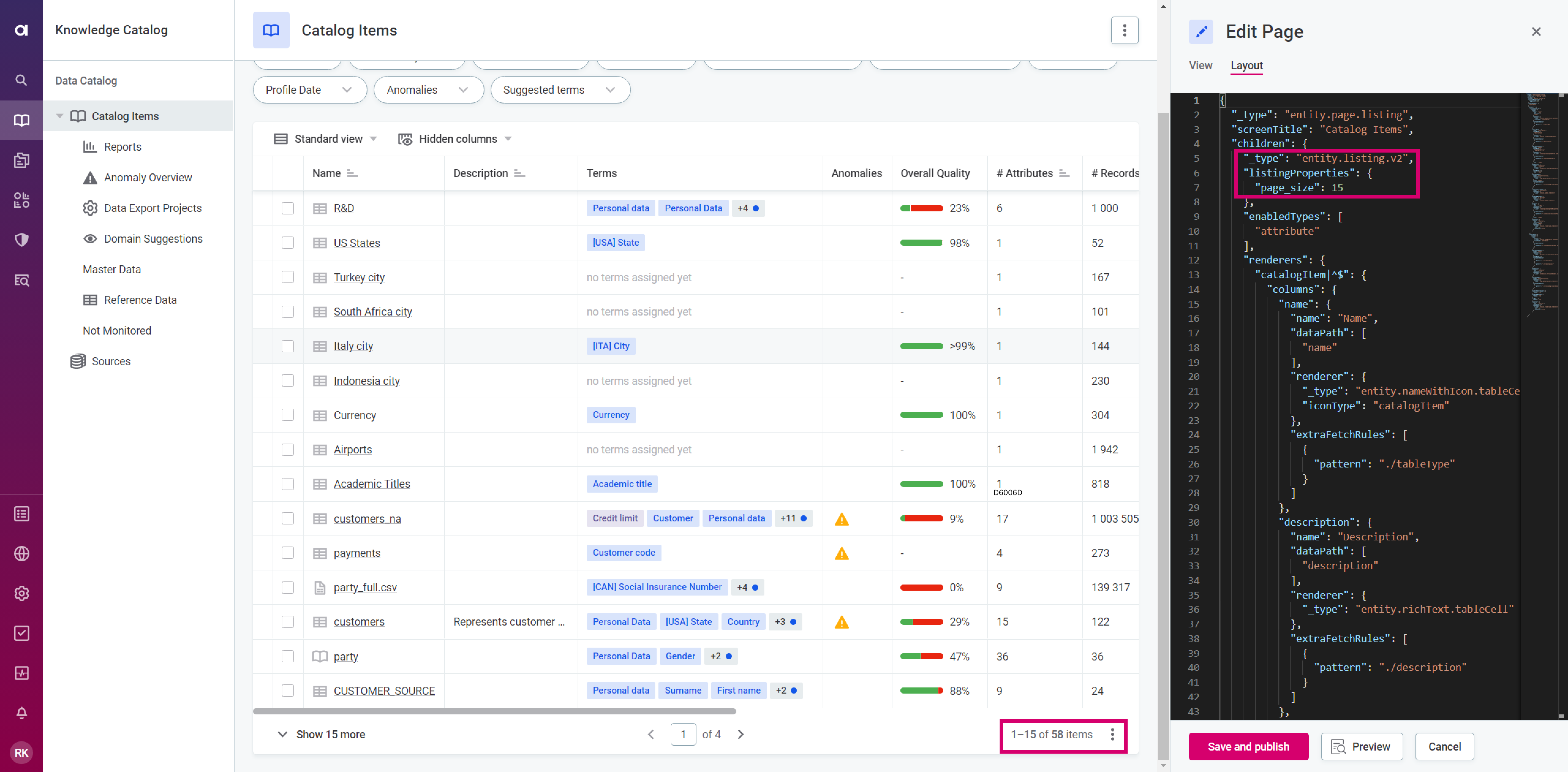
|
||
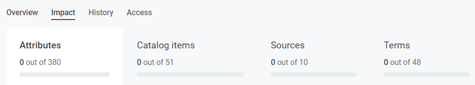
Configure policies impact widget and tab contents |
Add or delete the node name to add or extract it from the Impact widget or Impact tab.
In the following example the 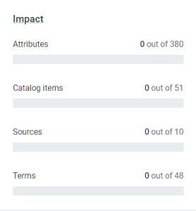
|
|
||
Display plain text widget without properties |
By default, if you don’t specify any properties for the widget, the widget doesn’t appear on the screen.
It is possible to display a widget with no properties but with just a plain description.
To do that, add the property for hiding the configuration and set it to false: As a result, an empty widget is shown: 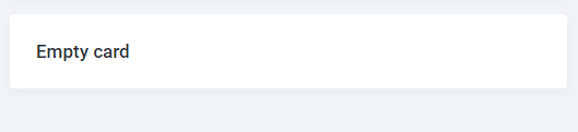
Usually, widgets without properties can be used for distinguishing between two similar pieces of information, like types of Relationships between objects. For example, this can be useful if there are two relation plugins and you need to distinguish between the two depending on the specific entity. 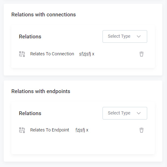
|
|
||
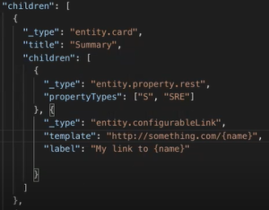
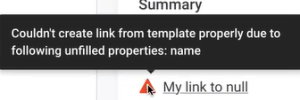
Link template rendering |
It is possible to render custom links as entity properties, which means that the construction of the target URL template is interpolated as entity properties. To do that, add the Depending on the template, the following validations are run on links:
|
|
||
Remove property (column) from entity listing (custom entities) |
Make sure there is a column with a specific widget in it, then disable it by adding |
|
||
Remove property (column) from entity listing (default entities) |
Find the specific widget and disable it by adding |
|
||
Rename widget with title attribute in JSON |
Find the |
|
||
Separate simple properties into two different cards |
Add another |
|
||
Display a property as a link |
To display a property as a link add a |
In the following example, we rendered the 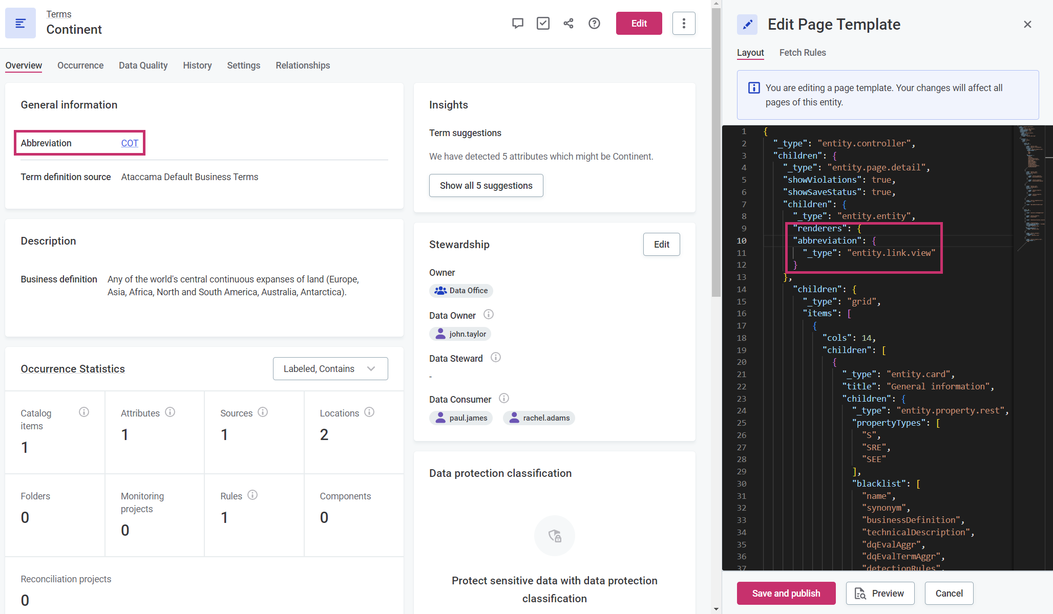
|
||
Change the layout of tables on the catalog item Data Structure tab |
You can change the layout of the Attributes and Indexes tables on the catalog item Data Structure tab by adding the To remove columns, use To add columns, list the columns in the desired order, in the same way you would do for the |
Layout structure: Removing a “Name” column: When adding a “Terms” column, you can use the |
Fetch rules
Fetch rules represent an array of objects containing each a pattern property as the only required parameter.
Each pattern describes what entity properties should be matched using the assignment provided while each assignment can match an arbitrary number of properties.
Any fetch rules defined by users are merged with the existing default fetch rules for the specific screen.
In addition, each fetch rule can contain an optional filter property, which contains an AQL expression used to select specific entities.
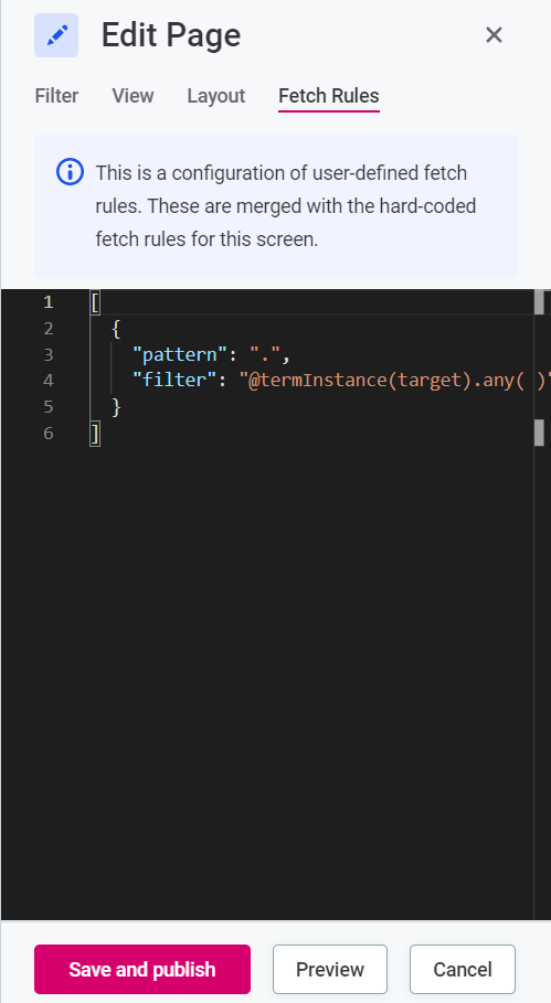
The pattern property shares some similarities with file path expressions in Linux shells, such as bash.
For example, it can be described as a relative property path (file path) from the entity that you are viewing (for example, detail screen) and it always starts with a dot-slash (./).
[
// 1) Fetch all non-array properties on the first level
{ pattern: './* ({S,SEE,SRE})' },
// 2) Fetch first 10 records of array properties on the first level
{ pattern: './* (AEE)', pageSize: DEFAULT_LISTING_PAGE_SIZE },
// 3) Fetch scalar properties and references on the second level
{ pattern: './*/* (S)' },
]
Match explicit properties
To match a property, you need to provide its name as a path.
[
  // Matches the name property
  { pattern: './name' },
  // Matches the number of records in an embedded object
  { pattern: './stats/numRecords' }
]
Match multiple explicit properties
The pattern property supports brace expansion (Brace Expansion).
This means that you can specify multiple options inside a pair of braces ({}) with individual items separated by a comma (,).
No spaces are allowed within braces.
[
  // Matches name and description property
  //  -> equivalent of 2 rules: ./name and ./description
  { pattern: './{name,description}' },
  // Matches name on both invoice and shipping address (embedded objects)
  //  -> equivalent of 2 rules: ./shippingAddress/name and ./invoiceAddress/name
  { pattern: './{shipping,invoice}Address/name' }
]
Property wildcard
You can match all properties on a certain level using an asterisk (*) as a wildcard.
However, due to cyclic implications, properties selected using a wildcard are not infinitely matched.
In general, if you are not building a generic entity screen, we recommend explicitly listing the properties needed for the selected scenarios.
[
  // Matches all direct properties of an entity
  { pattern: './*' },
  // Matches all properties of an embedded stats object
  { pattern: './stats/*' }
]
Type constraints
Besides specifying the property path, it is also possible to match properties by property type.
This is especially powerful in combination with the wildcard matching (*).
The type can be specified in parentheses after the path and should be separated by one or more spaces.
The type constraint can also take a subtype that is specified in parentheses (()).
[
  // Matches all direct scalar properties
  { pattern: './* (S)' },
  // Matches all direct String scalar properties
  { pattern: './* (S(String))' },
  // Matches all direct references to catalog item
  { pattern: './* (SRE(catalogItem))' }
]
The following types are supported:
-
Scalars
Swith an optional subtype of the name of the scalar. -
Single referenced entities
SREwith an optional subtype of the name of the referenced entity. -
Single embedded entities
SEEwith an optional subtype of the name of the embedded entity. -
Array embedded entities
AEEwith an optional subtype of the name of the embedded entity.
You can combine the type and subtype constraints with braces expansion as explained in the section about explicitly matched properties.
How fetch rules are applied
In order to apply fetch rules to some entity, they need to be expanded first. To do that, follow these steps:
-
Expand all braces (
{}). The assignments are effectively cloned with each token. -
Expand all wildcards (
*) using the metadata of a base entity. This produces more assignments for each entity property. -
Filter out the assignments based on property type constraint (ensure that, for example, the property that is bound to an assignment is of a specified type). The list of all assignments with their expanded property paths is now ready.
-
Group the assignments by the property path.
-
Reduce the assignments for each individual property path by overwriting the configuration options as they go (the last assignment overwrites the previous values).
Options
-
enabled?: boolean(default:true): For example, to omit the property name in the listing screen, you can disable it as follows:
{ pattern: './Name', enabled: false}If set to true, the matched property is fetched.
It is usually omitted in assignments and used explicitly only to blocklist previously enabled properties.
Listings
-
filter?: string: The AQL filter that should be applied to a listing as the default filter. Some filters are hidden from users; if a user enters their own filter, it is then appended to the existing one using the AND operator. For more information about AQL possibilities, see Search. -
orderBy?: string: The name of the property that should be used for default sorting. Only direct properties are supported, which means that paths to properties of embedded or referenced entities are not allowed. -
orderDirection?: 'ASC' | 'DESC': The order method (bound to the selected property inorderBy). -
pageSize?: number: The number of records that should be fetched. If thepageSize === 0, then only thetotalCountis fetched.
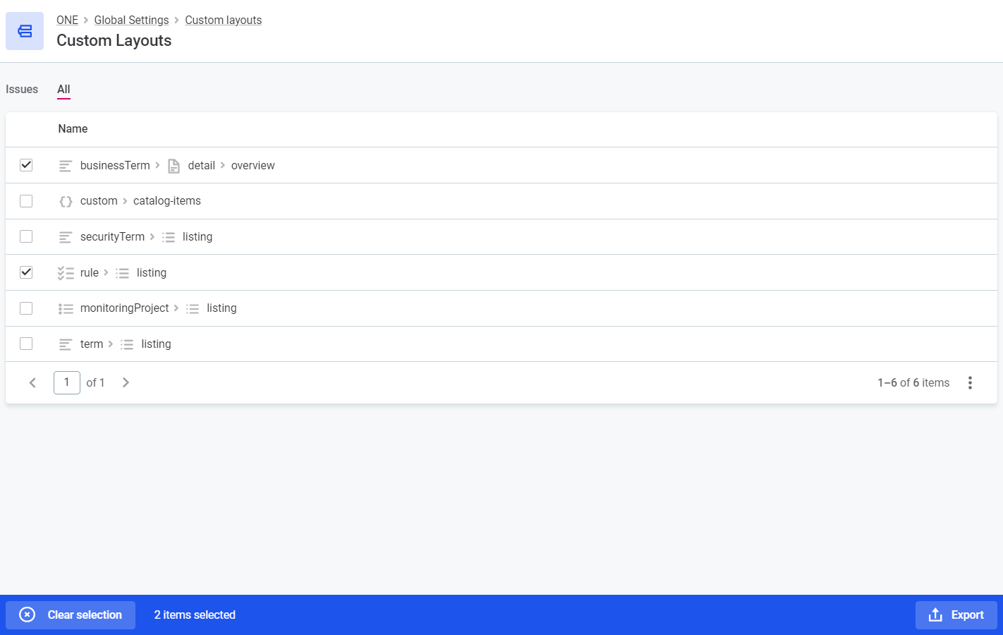
Custom layouts
For an overview of custom layouts, navigate to Global Settings > Custom Layouts.
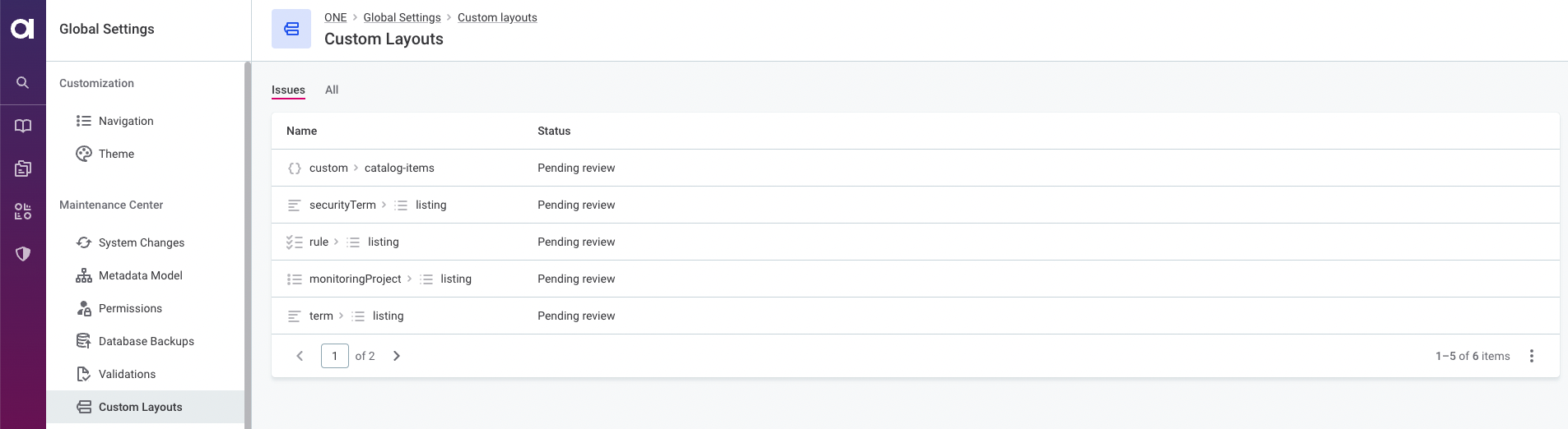
Two tabs are available:
-
All: Shows all customized layouts implemented in the application. Selecting a custom layout opens a side-by-side comparison of the current and previous layout versions, allowing you to see layout details.
You can export custom layouts and reuse them in another environment. To do so, select the layouts that you want to export in the list of layouts and select Export. For instructions about how to create an export, see Import and Export.
-
Issues: Shows customized layouts that have been modified during the last upgrade. Custom layouts that are showing conflicts with the default layout are listed with a Pending review status.
To resolve the issue, start by opening the custom layout and reviewing the changes. To attempt to automatically merge the conflicting layout, select Smart resolve. You can also edit the custom layout directly when comparing the changes.
To make sure you’re happy with the changes, select Preview and then Save and publish.
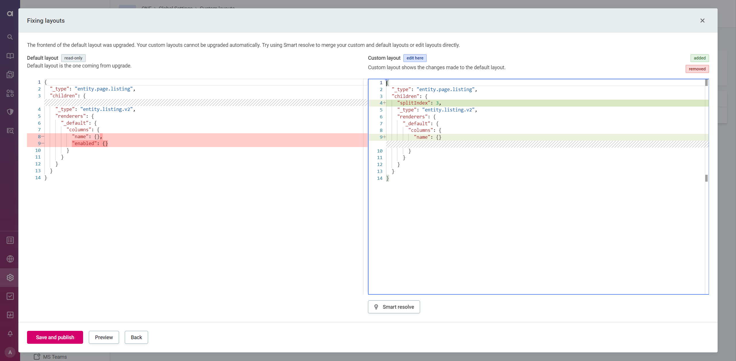
Once the new layout has been applied, a notification appears and the status of the custom layout changes from Pending review to Reviewed. Refreshing the page removes reviewed custom layouts from the Issues tab.
Was this page useful?