
Data Quality Reporting
This article describes how you can leverage data quality (DQ) metrics from ONE in Data Stories.
Thanks to data quality reporting, you can customize views and aggregate data quality across multiple monitoring projects and catalog items for more comprehensive insights. This way, you can create engaging narratives, boost data credibility, and use your reports as a decision-making tool.
|
Before proceeding, take a moment to get familiar with how data quality is evaluated in ONE:
|
Available DQ metrics and views
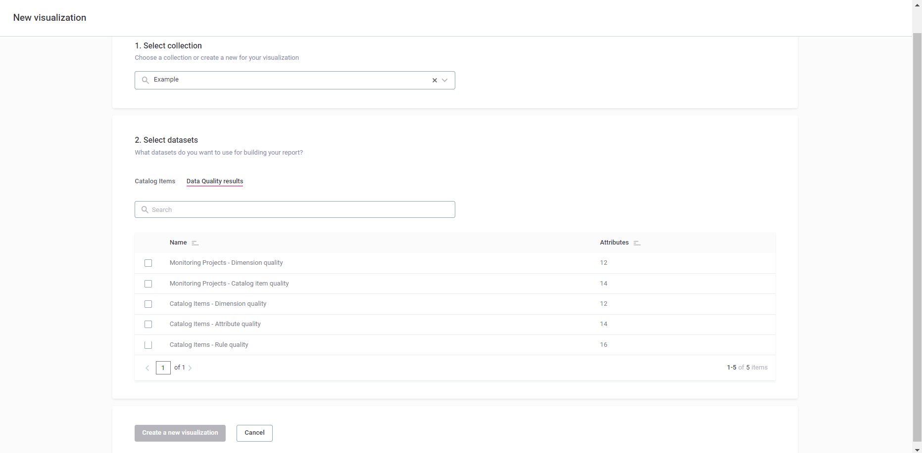
As outlined in Build a Visualization, you can incorporate DQ results as out-of-the-box datasets when creating a new visualization (Select datasets > Data Quality results).
The following sections provide more details and examples of different types of DQ metrics that you can employ in Data Stories.
Monitoring projects - Overall quality
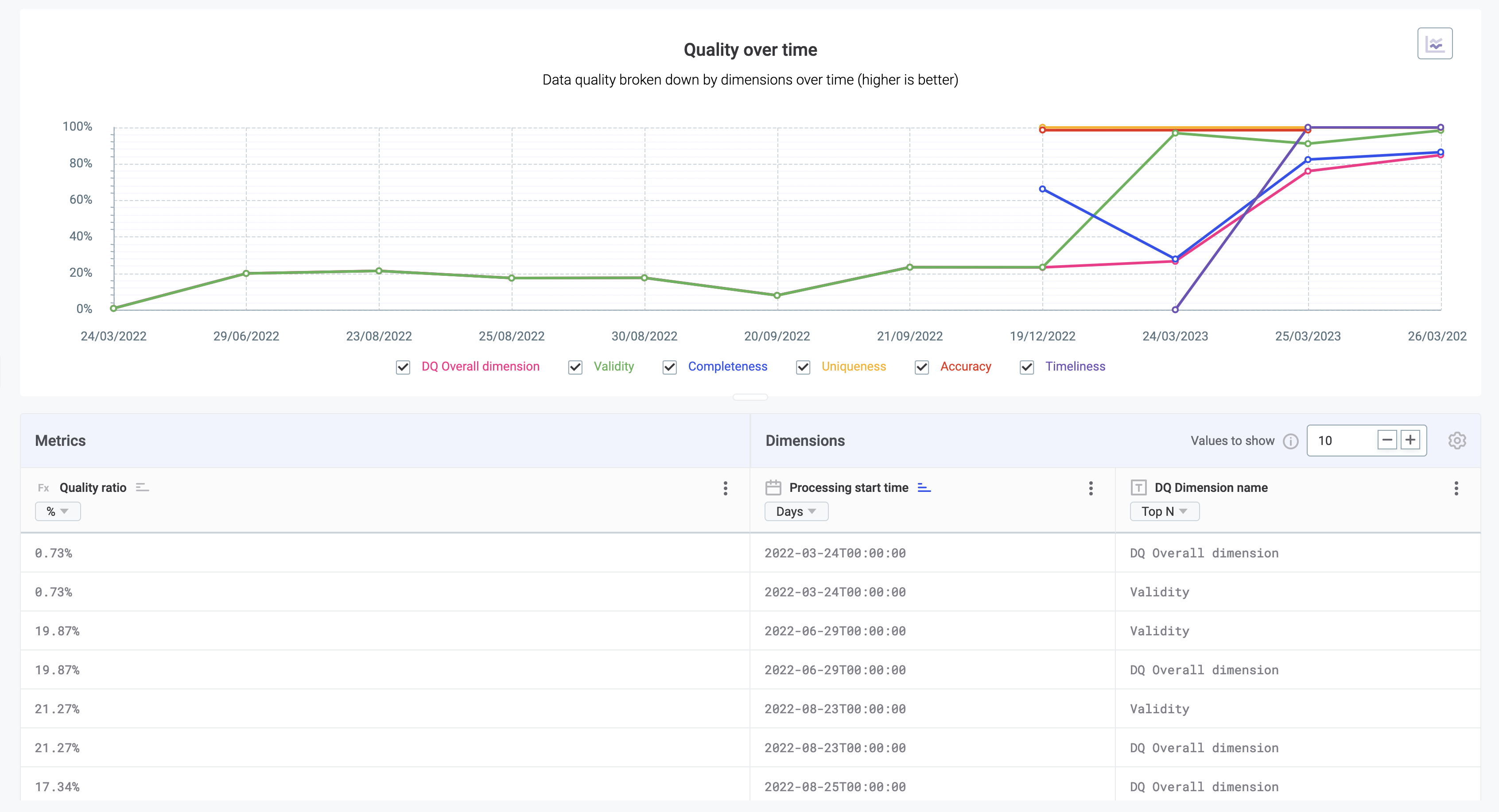
In Data Quality results, select Monitoring Projects - Dimension quality to aggregate DQ metrics from all your monitoring projects.
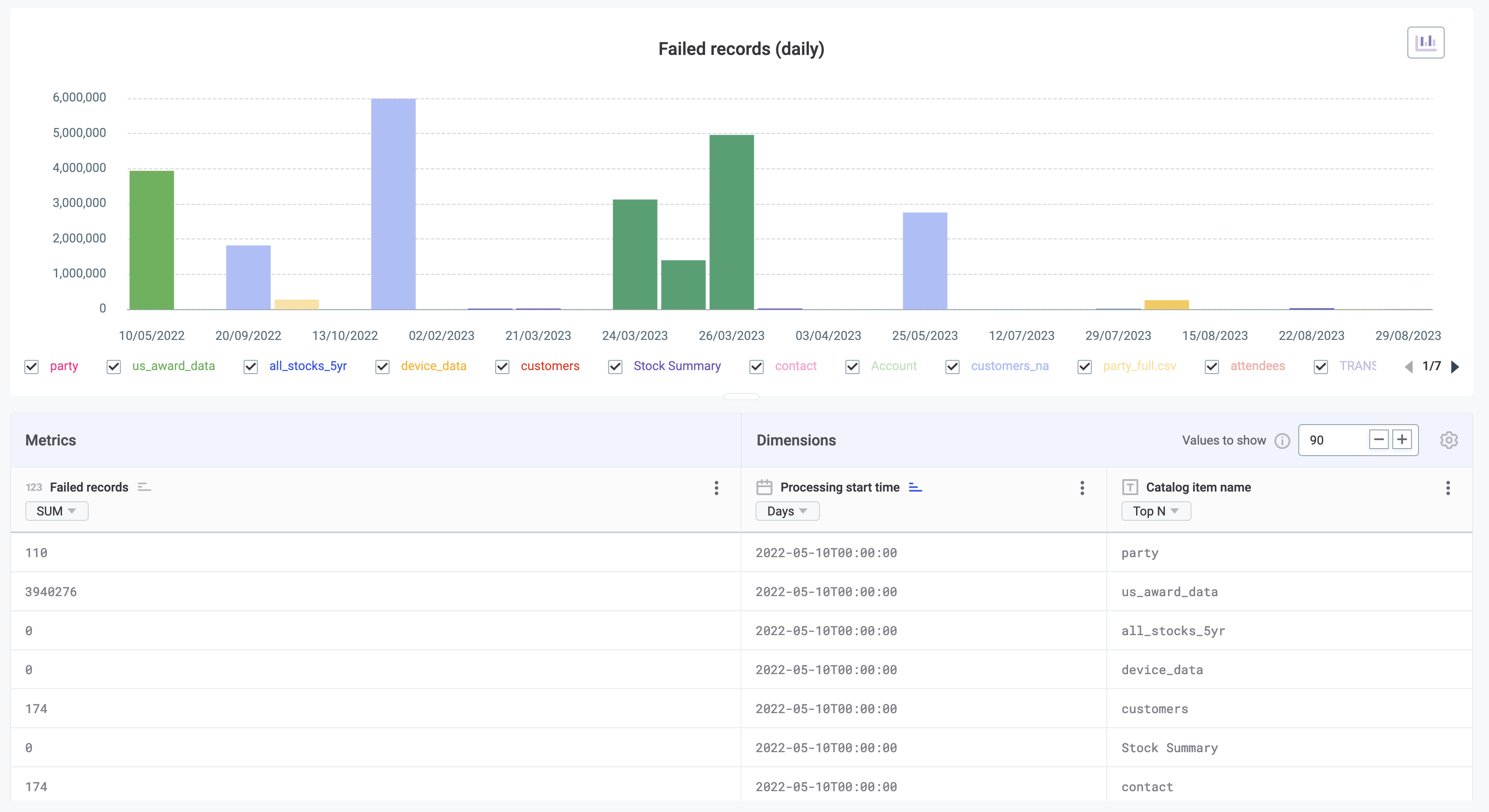
Example: Imagine a multi-series line chart that shows two types of dimensions: aggregated DQ metrics (like validity and accuracy) and the processing start time, which allows you to track changes over time.
The metrics represent the quality ratio for each dimension. Each line illustrates how the overall quality changes for all monitoring projects over a specific period.
Monitoring projects - Catalog item DQ
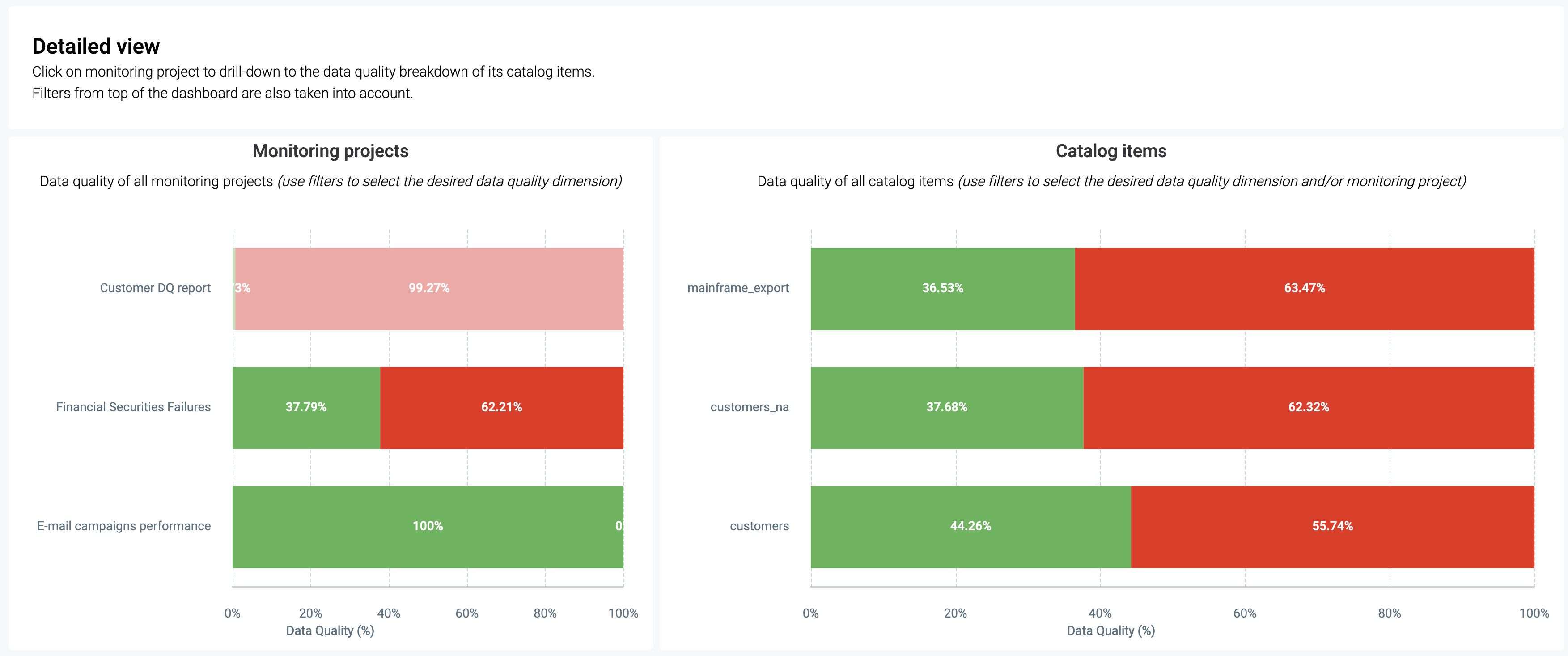
In Data Quality results, select Monitoring Projects - Catalog item quality to identify specific data quality concerns in catalog items within a monitoring project.
Example: Consider two interlinked category charts. The first one allows you to select a monitoring project (dimension), and the second acts as a filter in order to display only the catalog items (dimension) for that project.
Both charts measure data quality as a percentage of passed or failed records using color-coding: green for passed and red for failed.
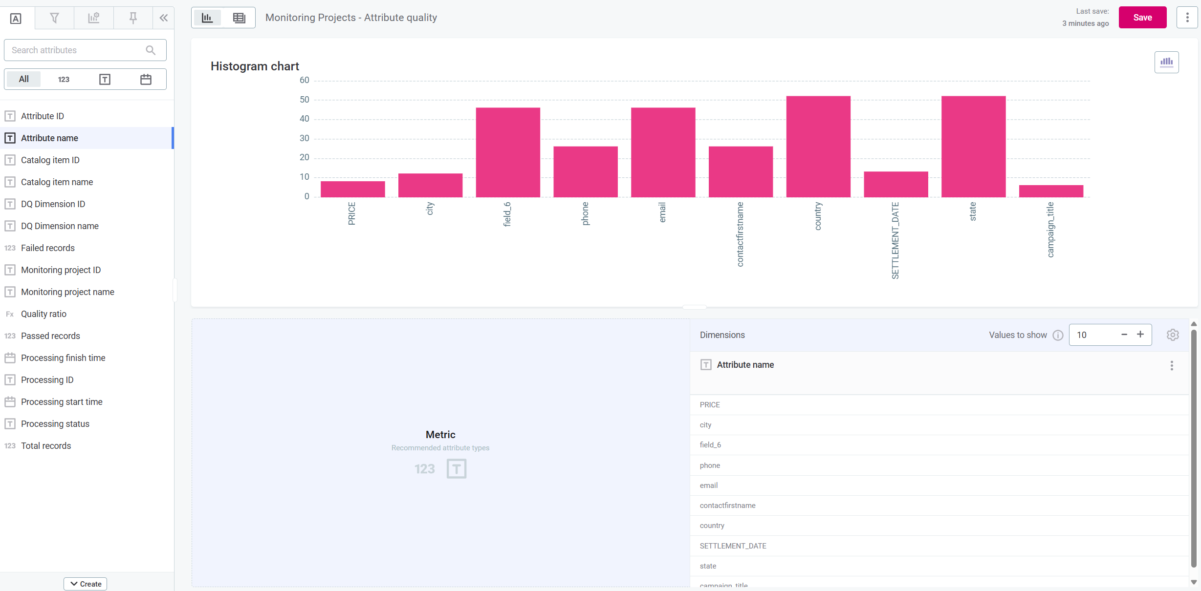
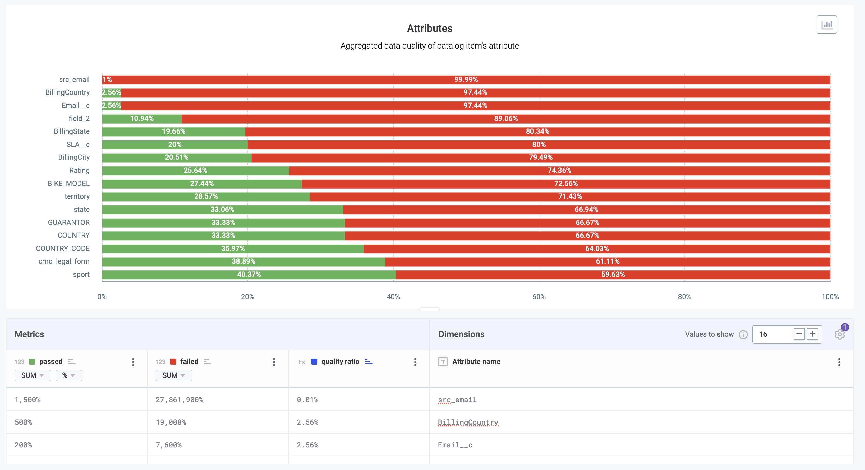
Monitoring projects - Attribute-level DQ
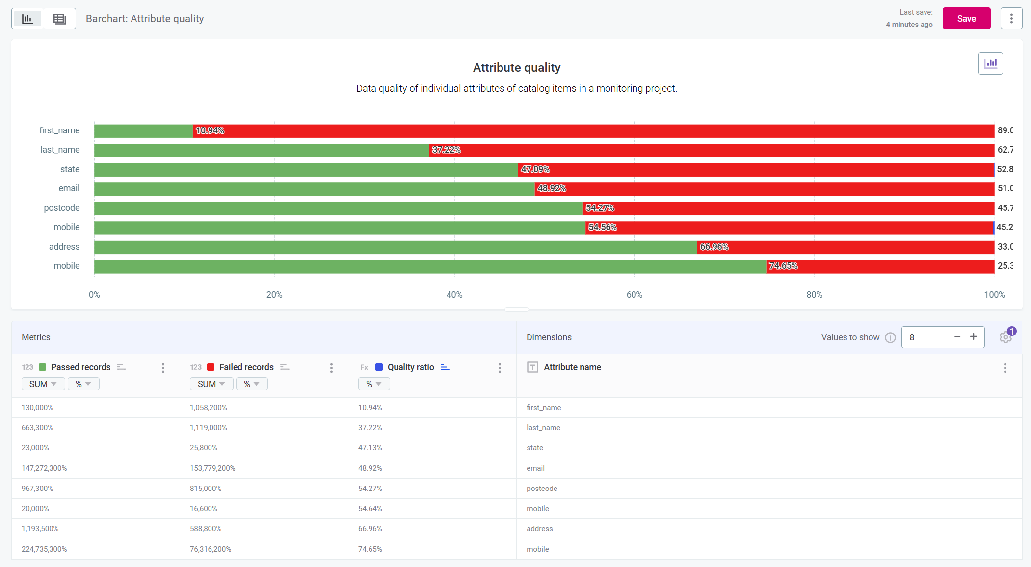
In Data Quality results, select Monitoring Projects - Attribute quality to assess data quality on attribute level within a specific monitoring project.
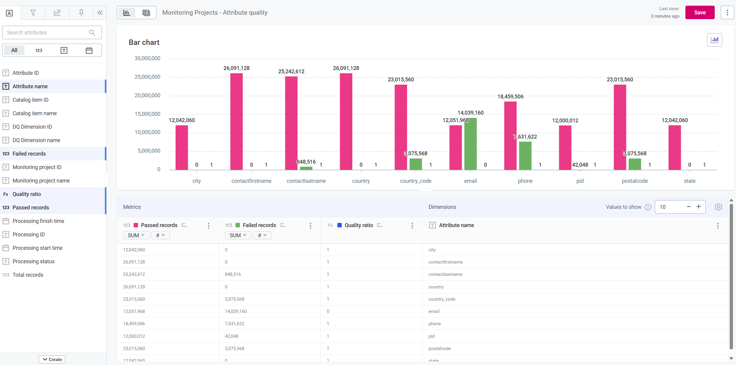
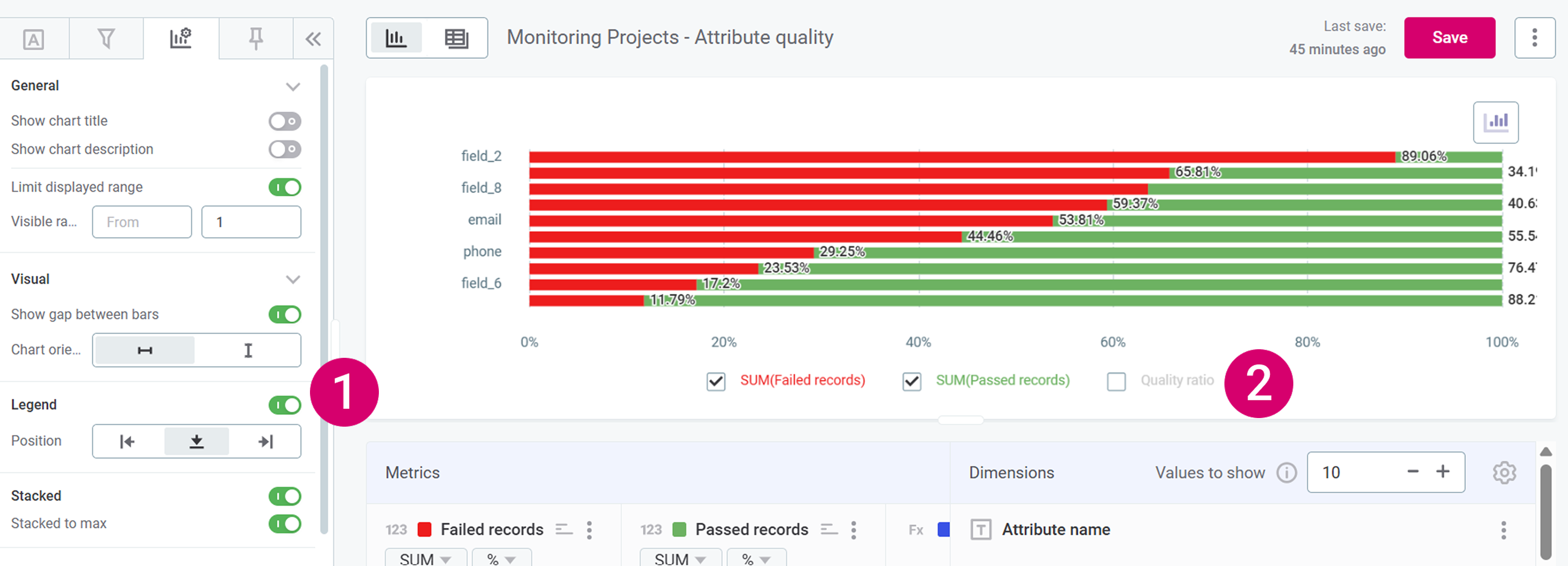
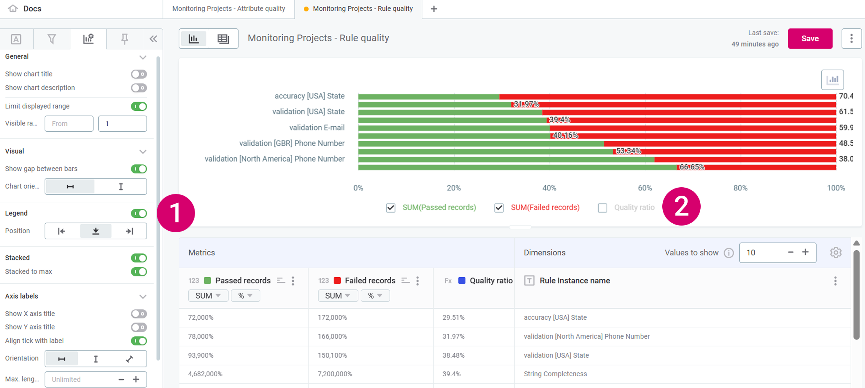
Example: Imagine a stacked bar chart showing the percentage of passed and failed records for specific attributes.
| You can create different visualizations as best suit your use case, but for a step-by-step guide on how to create the chart used in the example, see Example: Create attribute quality barchart. |
Example: Create attribute quality barchart
-
Create a new visualization: you can do this either from the Visualizations home screen by selecting Create visualization, or by opening a new tab in an existing collection.
-
Select Data Quality results and then Monitoring Projects - Attribute quality.
-
Select Add.
-
You first need to add Metrics and Dimensions.
-
In Dimensions, add Attribute name, by dragging the item from the left-hand toolbar into the space labeled Dimension.
-
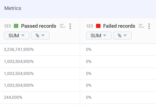
In Metrics, add Passed records, Failed records, and Quality ratio, by dragging the items from the left-hand toolbar into the space labeled Metric.
-
-
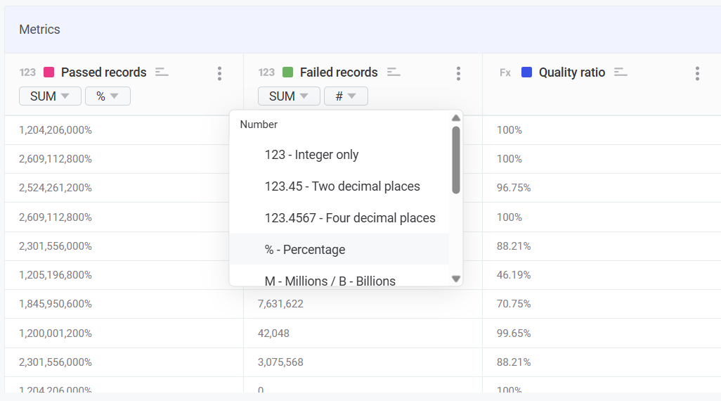
Change the format of Passed records and Failed records to percentages and change the colors to red for failed records and green for passed records.
-
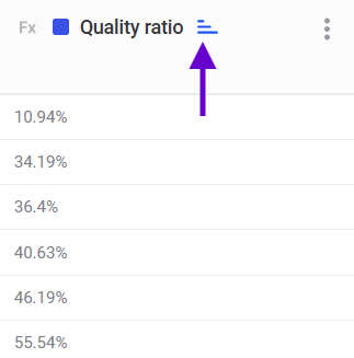
In Quality ratio, use the sort by icon to order the attributes from lowest percentage of passed records to highest. This helps you identify problems.
Quality ratio is only used for sorting. We remove it from the chart view in step 11.

-
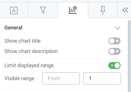
In the left-hand toolbar, navigate to Visualization properties.

-
Optionally, add a chart name and description by selecting Show chart title and Show chart description respectively.
-
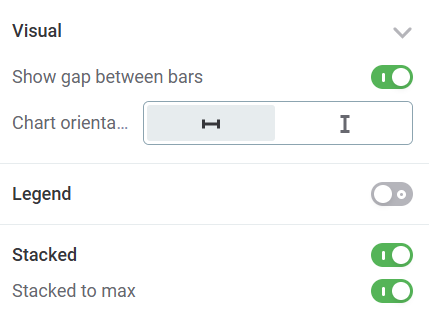
Enable Limit displayed range and provide an upper limit of '1'.
-
Change the chart orientation to Horizontal and select both Stacked and Stacked to max.
-
Remove Quality ratio from your chart by enabling Legend (1), clearing Quality ratio (2), and disabling the legend again.
-
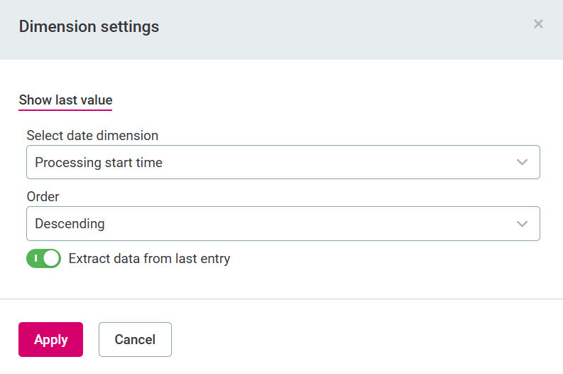
Your chart is almost ready. The final important step is to make sure you are only displaying the latest results.
By default, result from all monitoring runs are displayed. To change this, select the settings icon in Dimensions.

-
In Select date dimension, select
Processing start time. -
In Order, select
Descending. -
Select Extract data from last entry.
-
Select Apply.
-
-
Finally, choose how many attributes you want to show on your chart in Values to show.
You can adjust other visualization properties as you like, but using this tutorial, you should end up with a chart that shows you:
-
Stacked percentages of passed and failed records for a select number of rule instances.
-
Attributes ordered from lowest data quality evaluation results to higher.
-
Only the most recent results.
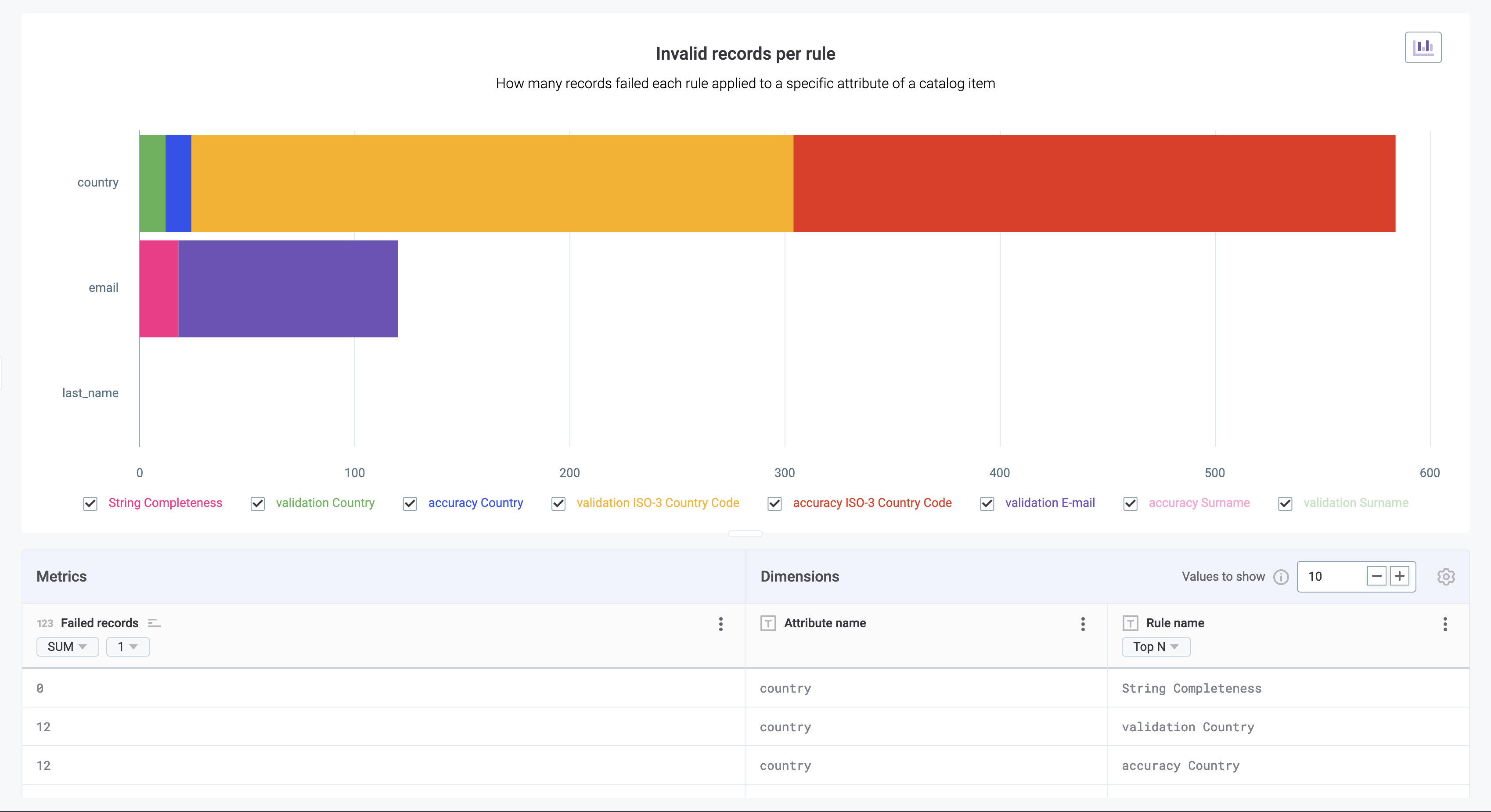
Monitoring projects - Rule instance DQ
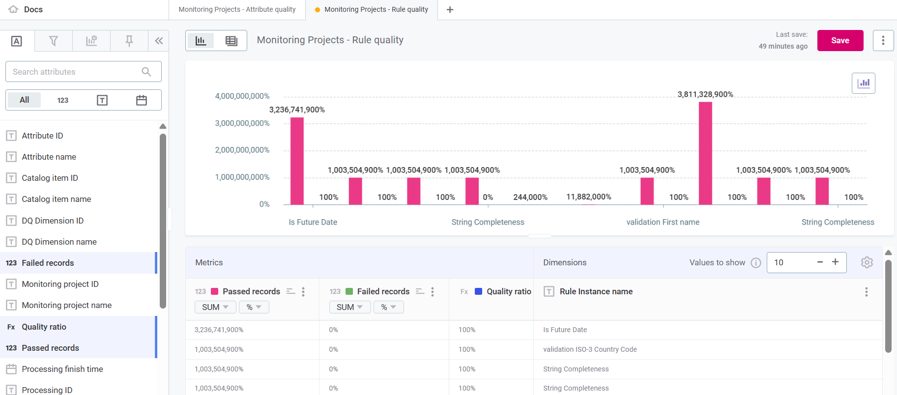
In Data Quality results, select Monitoring Projects - Rule quality to see the data quality of records in a monitoring project based on the specific rules applied to them.
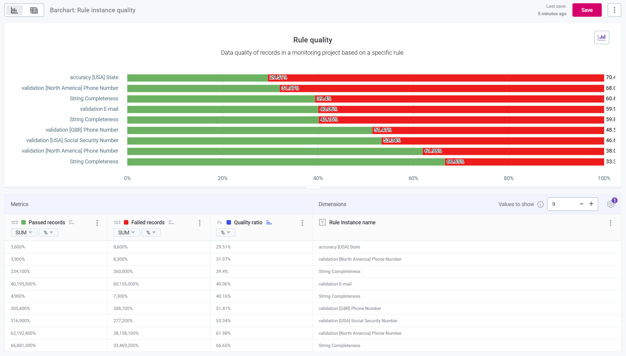
Example: Imagine a stacked bar chart showing the percentage of passed and failed records for a specific rule instance.
| You can create different visualizations as best suit your use case, but for a step-by-step guide on how to create the chart used in the example, see Example: Create rule quality barchart. |
Example: Create rule quality barchart
-
Create a new visualization: you can do this either from the Visualizations home screen by selecting Create visualization, or by opening a new tab in an existing collection.
-
Select Data Quality results and then Monitoring Projects - Rule quality.
-
Select Add.
-
You first need to add Metrics and Dimensions.
-
In Dimensions, add Rule instance name, by dragging the item from the left-hand toolbar into the space labeled Dimension.
It is important this is Rule instance name and not Rule name. Rule instance name maps to the specific instance of the rule applied to attributes in your monitoring project. 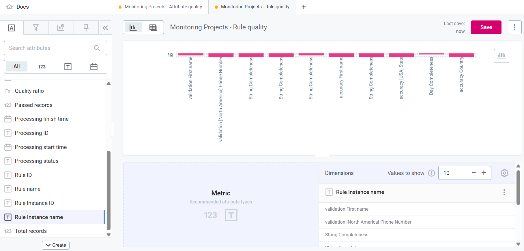
-
In Metrics, add Passed records, Failed records, and Quality ratio, by dragging the items from the left-hand toolbar into the space labeled Metric.
-
-
Change the format of Passed records and Failed records to percentages and change the colors to red for failed records and green for passed records.
-
Use Quality ratio, use the sort by icon to order the attributes from lowest percentage of passed records to highest. This helps you identify problems.
Quality ratio is only used for sorting. We remove it from the chart view in step 11.
-
In the left-hand toolbar, navigate to Visualization properties.
-
Optionally, add a chart name and description by selecting Show chart title and Show chart description respectively.
-
Select Limit displayed range and provide an upper limit of '1'.

-
Change the chart orientation to Horizontal and select both Stacked and Stacked to max.

-
Remove Quality ratio from your chart by enabling Legend (1), clearing Quality ratio (2), and disabling the legend again.
-
Your chart is almost ready. The final important step is to make sure you are only displaying the latest results.
By default, result from all monitoring runs are displayed. To change this, select the settings icon in Dimensions.
-
In Select date dimension, select
Processing start time. -
In Order, select
Descending. -
Enable Extract data from last entry.
-
Select Apply.

-
-
Finally, choose how many attributes you want to show on your chart in Values to show.
You can adjust other visualization properties as you like, but using this tutorial, you should end up with a chart that shows you:
-
Stacked percentages of passed and failed records for a select number of attributes.
-
Rules ordered from lowest data quality evaluation results to higher.
-
Only the most recent results.
Catalog items - Overall quality
In Data Quality results, select Catalog Items - Dimension quality to inspect the health of individual catalog items and highlight which areas require remediation.
Example: Consider a bar chart featuring two dimensions: catalog items and the processing start time, which allows you to track changes over time.
The metrics indicate the number of failed records for each catalog item over a specified period.
Catalog items - Attribute-level DQ
In Data Quality results, select Catalog Items - Attribute quality to assess data quality on attribute level within a specific catalog item.
Example: Visualize a category chart where dimensions list attributes within a single catalog item and the metrics measure the record quality as passed or failed, as well as the quality ratio.
Color-coding is used to highlight the percentage of failed and passed records: green for passed and red for failed.
Catalog items - Rule instance DQ
In Data Quality results, select Catalog Items - Rule quality to evaluate the data quality of records based on the specific rules applied to them.
Example: Think of a category chart featuring two dimensions: rule instances and specific catalog item attributes.
Metrics indicate the total number of failed records, with color codes indicating the volume of records failing each applied rule.
Was this page useful?