
Build a Visualization
To use the Visualization view, you first need to build a visualization.
To do this, drag and drop attributes from the left-side menu to Metrics and Dimensions columns.
| From 15.3.0, Data Stories leverages data protection classification that prevents unauthorized access to protected data, as signaled by visual indicators (lock icons) and notifications. For more information, see Data Protection Classification in Data Stories. |
Assign attributes
The Dimensions column can hold a maximum of two attributes for most visualization types. However, for Pivot table visualizations, there’s no such limit.
The Metrics column is more flexible: it can hold as many attributes as needed.
-
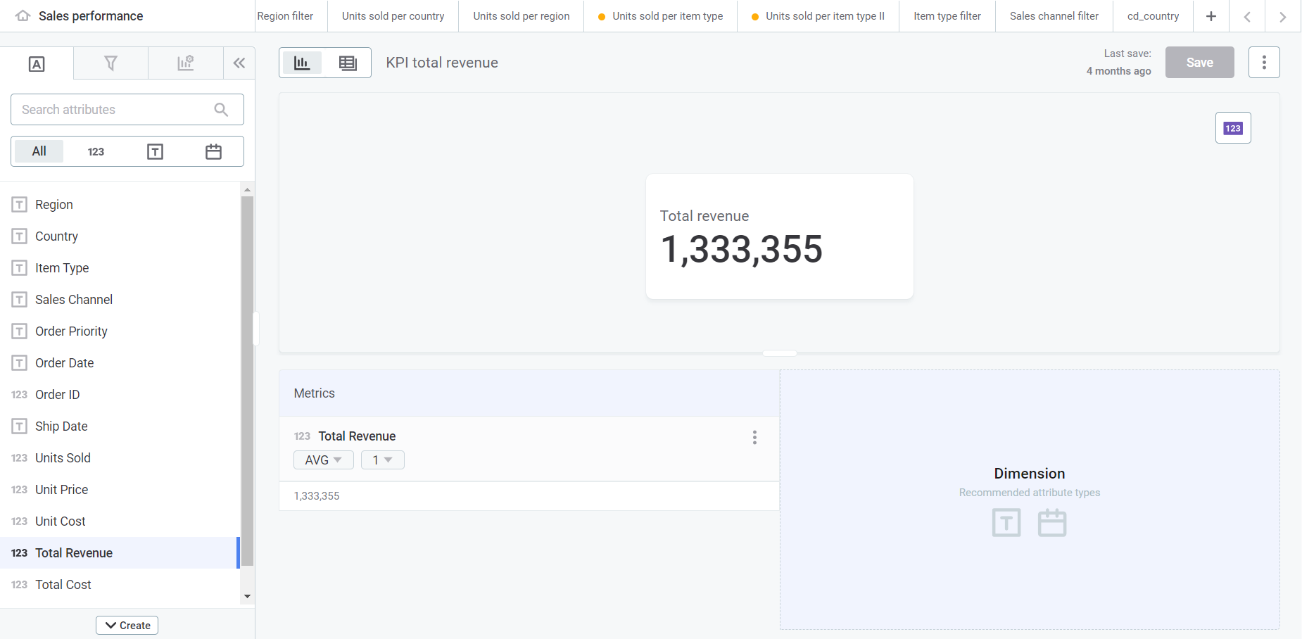
If you assign an attribute only to the Metrics column, the screen displays a KPI by default.
-
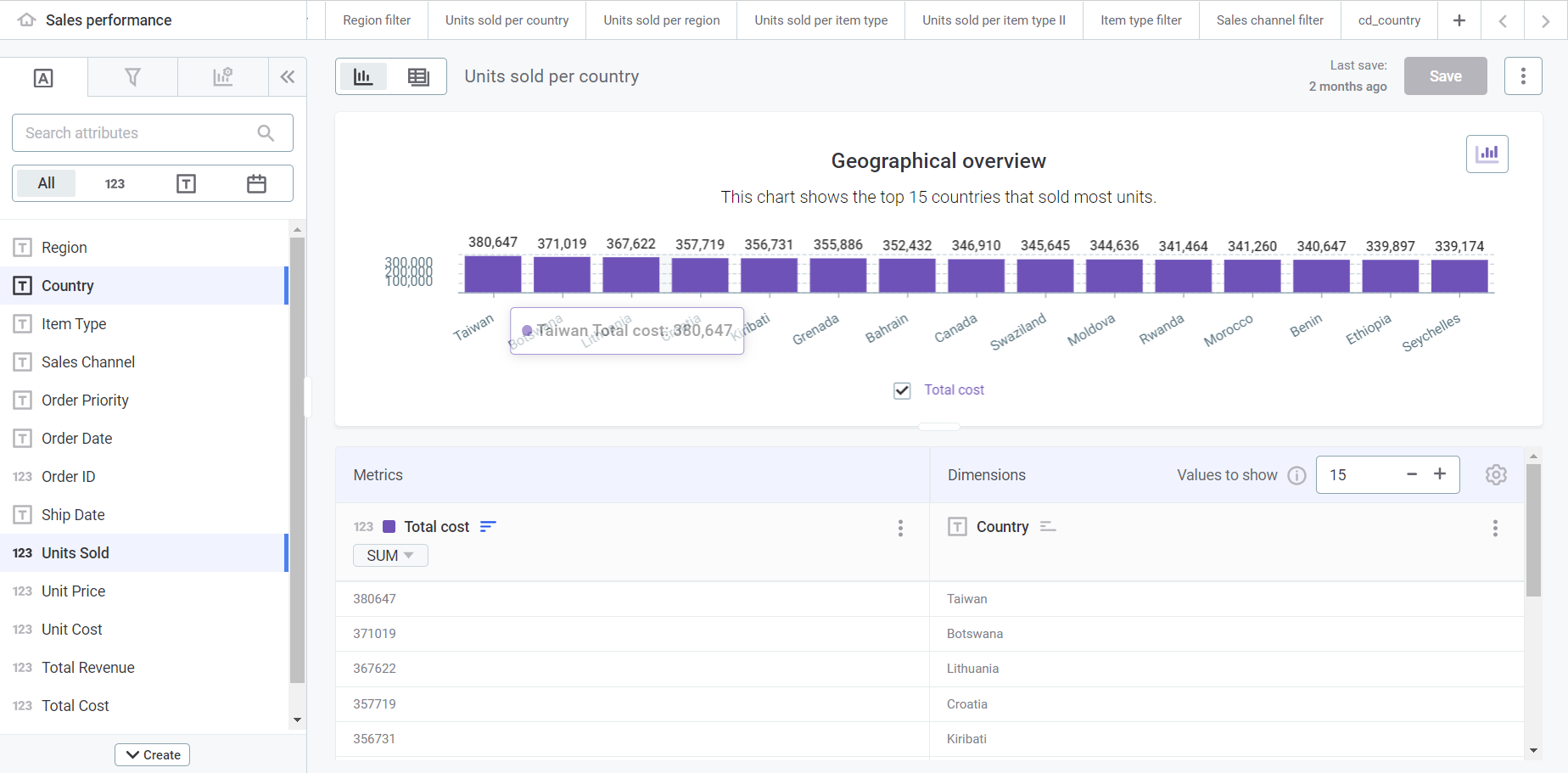
If you assign attributes to both the Metrics and Dimensions columns, the screen displays a bar chart by default.
You can change this later in the process.
When assigning an attribute to a column, the aggregation functions available depend on the data type of the attribute:
-
For numeric values: The default function when selecting numeric values is
sum(). Other functions available are listed in Select and configure your chart. -
For string values: The default function when selecting a string value is
count(). Other functions available are listed in Select and configure your chart.
-
| You can also create custom attributes. To learn more, see Create Custom Attributes. |
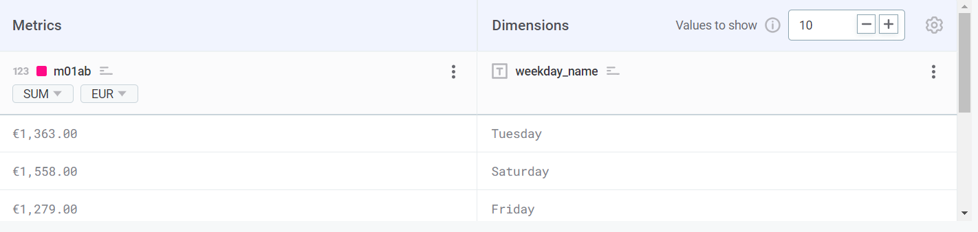
Configure and customize columns
Dimensions column
-
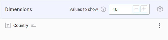
Define Values to show. If modified, it changes how many rows are displayed in the chart from the selected data asset. The maximum and minimum values depend on the type of chart.
-
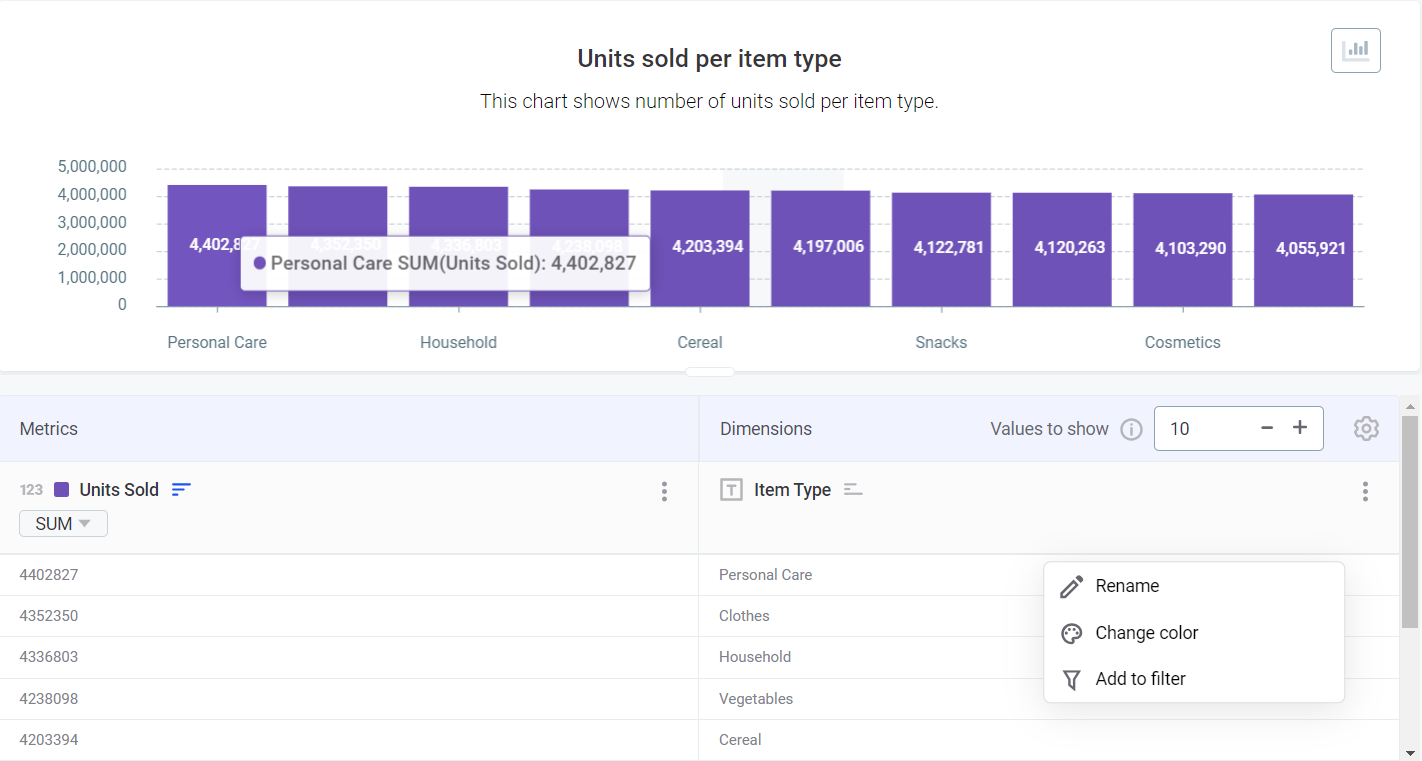
Rename and/or assign a custom color (Change color) for each dimension value. To find these options, hover over the value you want to change and open the three dots menu.
If you select Change color, you can choose among standard colors, Ataccama colors, or customize your own.
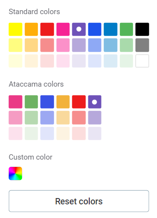
Once you change the default color of a dimension a different one, a shortcut icon with the selected color is displayed next to the name of the dimension.
Use this shortcut to change the color of the dimension again or reset it to the default one.
-
If you set to or more attributes as dimensions and the selected visualization type is Bar Multiseries, Line Multiseries, Heatmap, or Bubble chart, the Top/Bottom values feature becomes available.
This narrows down how many values are displayed for the second attribute based on the
sum()of values of the primary metric.In Top/Bottom settings, select the number of values to display for the second attribute and choose the order: ascending (Top) or descending (Bottom). The application then shows those attribute values with the highest or lowest metric values respectively, using
sum()as the default aggregation function.You can also define the maximum number of values that you want shown.
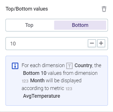
Swap the order of attributes in the Dimensions column by dragging one of them to the left or to the right (with Bottom 10 as the default option). If you turn this option off, all values for all included dimensions are displayed instead. This might impact negatively the performance of Data Stories. For more information about aggregation functions, see Create Custom Attributes, section Supported functions and operators.
For more information about format types that can be applied to numeric and date values, see Format Your Values.
Metrics column
-
Choose an aggregation function to apply to your column. Available functions depend on the data type of the attribute placed in the column.
-
For numeric values: The default function when selecting numeric values is
sum(). -
For string values: The default function when selecting a string value is
count().
-
-
To change the default aggregation function, select it under the metric name.
Alternatively, you can do this from the three dots menu.
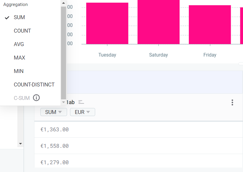
For more information about available aggregation functions, see Create Custom Attributes, section Supported functions and operators. Certain functions are available only for some chart and dimension types. For example, C-SUMfunction requires Date attribute type in Dimensions. -
Customize your metrics using the three dots menu. You can set an alias for the metric, change the color, or format the values as needed.
If you change the color, you can choose among standard colors, Ataccama colors, or customize your own.
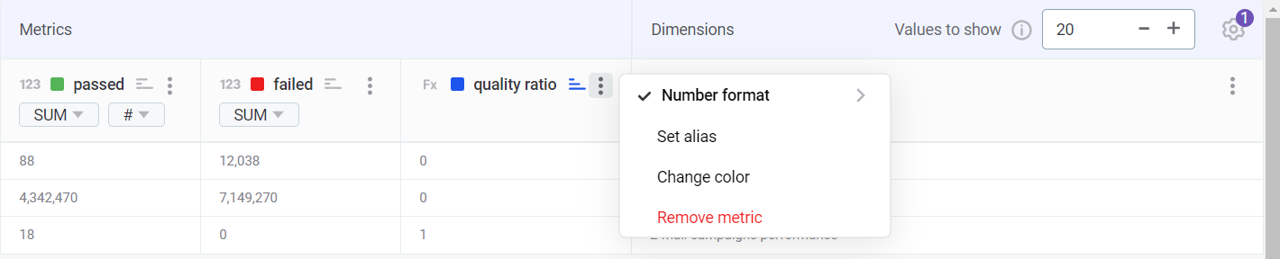
For more information about format types that can be applied to numeric and date values, see Format Your Values. Once you add a specific format to your values, a shortcut appears next to the aggregation function, under the metric label.
Use this shortcut to change the value format again or remove it completely.
Sort values
To sort your data, use the icons next to Dimensions and Metrics columns.
Sorting is only allowed for the primary dimension (the one located on the left-side of the menu). Metrics can be sorted without limitations.
| Icon | Description |
|---|---|

|
By default, data is displayed unsorted. |

|
Click the sort icon once to display your data in ascending (ASC) order. |

|
Click the sort icon twice to display your data in descending (DESC) order. |
Select and configure your chart
-
Select the chart icon to swap the default Bar chart to one of your preference.
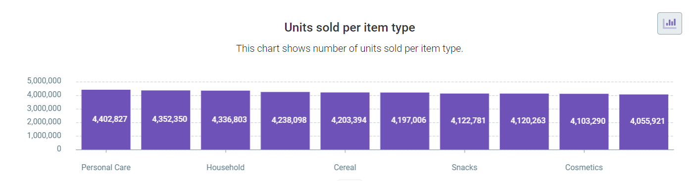
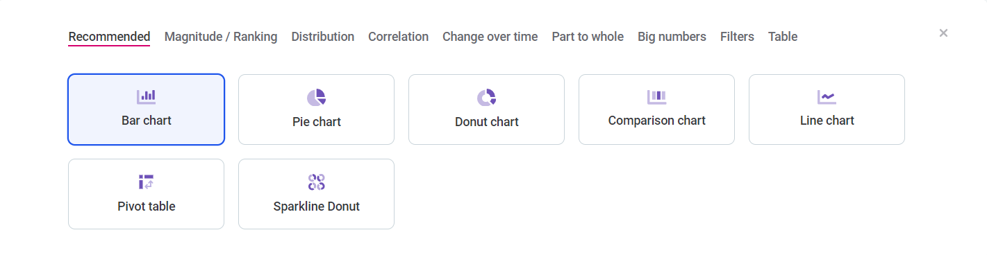
See Recommended charts for tips about how to choose the appropriate chart type depending on the data type of your dataset. -
After assigning attributes to Dimensions and Metrics and selecting a chart type, configure its basic properties by switching to the Chart tab in the left-side menu.
Some basic properties are grouped in General and Visual menus. Additionally, select if you want to display the chart title, legend, axis labels, and data labels or not.
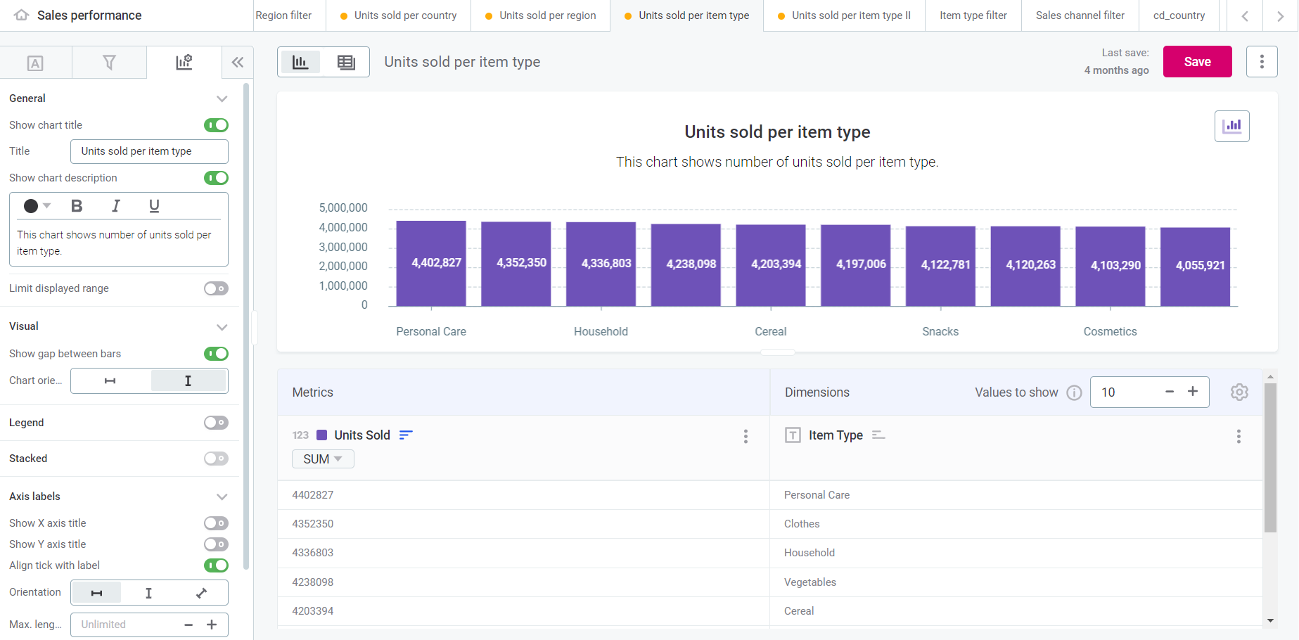
Available properties vary depending on the selected chart. For more details about how to configure different chart types, see Visualization Overview.
Recommended charts
Some charts are better suited for your dataset depending on the type of data in question. These recommendations might vary for each visualization.
In addition, certain charts require further configuration of metrics and attributes and might not be available in this menu.
If our recommendation doesn’t align with your use case, choose a different chart type.
Supported charts are organized in chart category tabs.
| Chart category | Description | Charts included |
|---|---|---|
Magnitude / Ranking |
These charts visualize size differences and the position of elements in ordered lists. |
|
Distribution |
These charts display values in the dataset based on how often they occur (frequency). |
|
Correlation |
These charts display the relationship between two or more elements. |
|
Change over time |
These charts visualize changing trends. |
|
Filters |
These widgets enable you to refine the data displayed in your charts and tables, allowing for a more targeted and focused analysis. |
|
Part to whole |
These charts show how a single element can be broken down into more parts. |
|
Big numbers |
These charts display important numerical values prominently and are used to showcase KPIs or the significance of a specific metric. They emphasize simplicity and provide a clear visual representation of single values. |
|
Table |
These tables enable a dynamic arrangement and restructuring of data for exploring relationships and patterns. |
|
Save your visualization
Once you’ve customized your visualization, select Save.
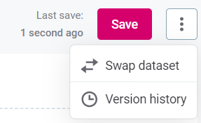
| The last saved timestamp is shown to the left of the Save option. |
|
Use the three menu to:
|
Was this page useful?