
Visualizations
Data Stories provides you with a powerful visualization builder to create compelling charts and quickly identify patterns and trends in your data. You can then include those insights in your story or dashboard.
Before you start
In Data Stories, you can work with ONE catalog items and SQL catalog items, as well as ONE Data tables.
In terms of data sources, the application supports AWS Aurora PostgreSQL, PostgreSQL, and Snowflake connections.
Before creating a visualization, prerequisites apply. To learn more, see Reports from Data Stories.
| From 15.3.0, Data Stories leverages data protection classification that prevents unauthorized access to protected data, as signaled by visual indicators (lock icons) and notifications. For more information, see Data Protection Classification in Data Stories. |
Create a visualization
-
Go to the Data Stories home page and select Create visualization.
Alternatively, you can do this from Your visualizations screen or from the three dots menu of a specific collection.
Open and work in an existing visualization by clicking the relevant card that is showcased on Your visualizations screen.
You can also make a copy of an existing visualization from the home page or in Your visualizations page by selecting the icon next to the item in question and then Duplicate.
-
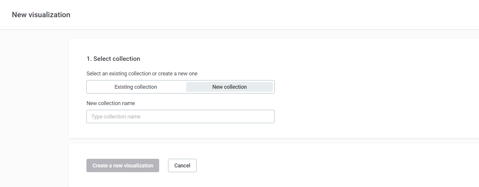
In New visualization, select an existing collection or create a new one where you want to store your visualization. By default, the option is set to Existing collection. If you choose this, select the desired collection from the dropdown menu.
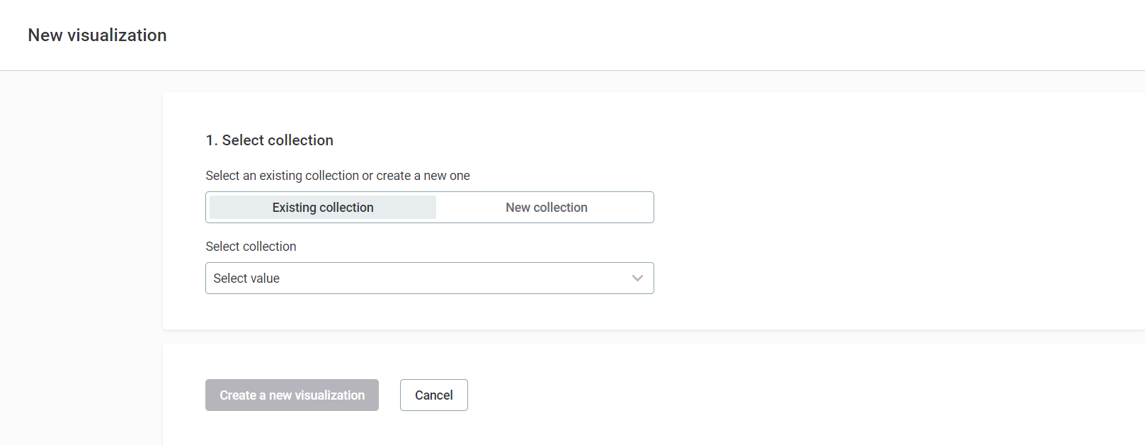
Visualizations must always reside within a collection.
To create a new one, switch to New collection, then enter the name for this new collection in the specified field.
-
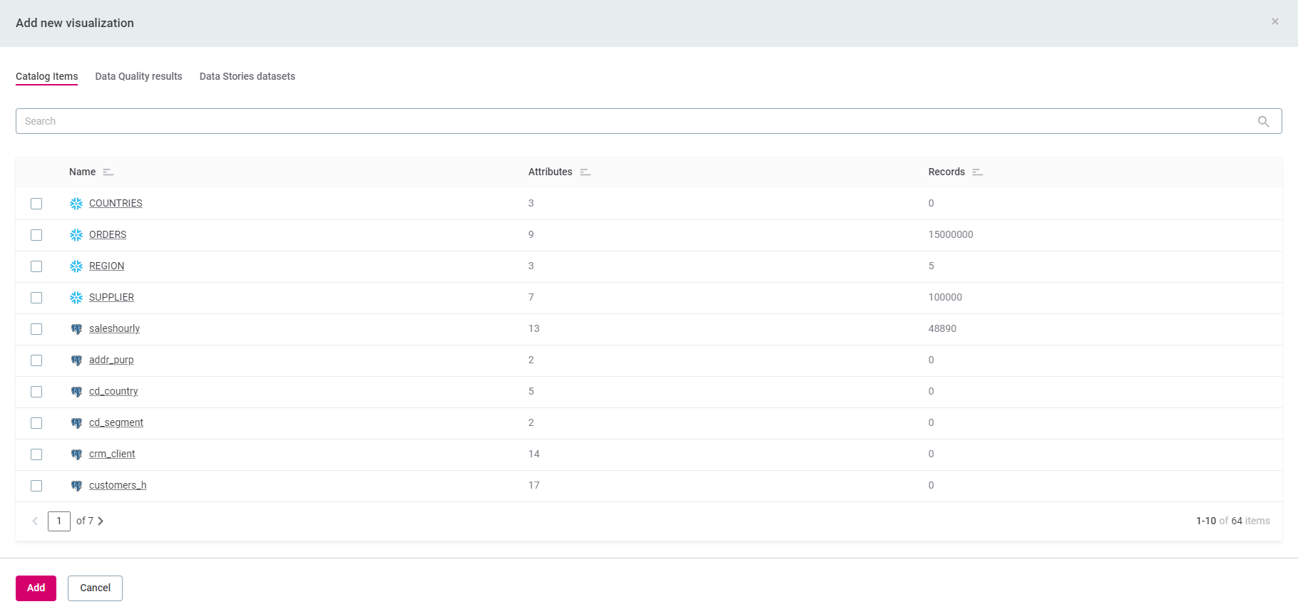
Select the source catalog item or data quality (DQ) results from the list provided.
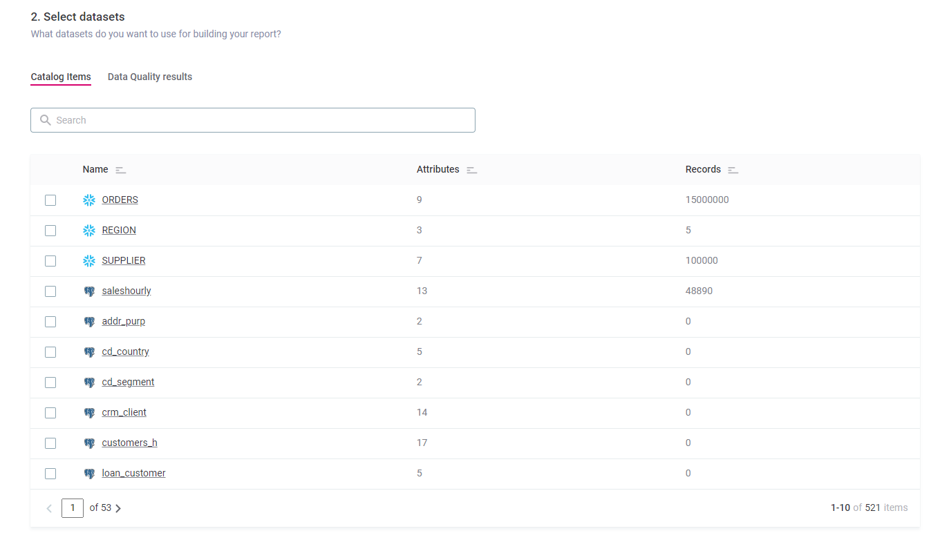
Data quality results might differ based on your selected criteria. To better understand how Data Stories integrates with Ataccama ONE Data Quality module, see Data Quality Reporting.
-
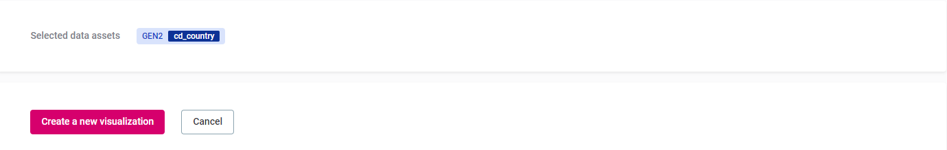
Select Create a new visualization.
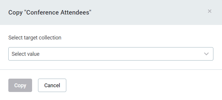
Copy a visualization
You can copy an existing visualization from Your visualizations screen to a different collection.
To copy a visualization:
-
Locate the visualization in the specific collection.
-
In the three-dots menu of the visualization, select Copy.
-
Select the collection to which you want to copy your visualization and select Copy.
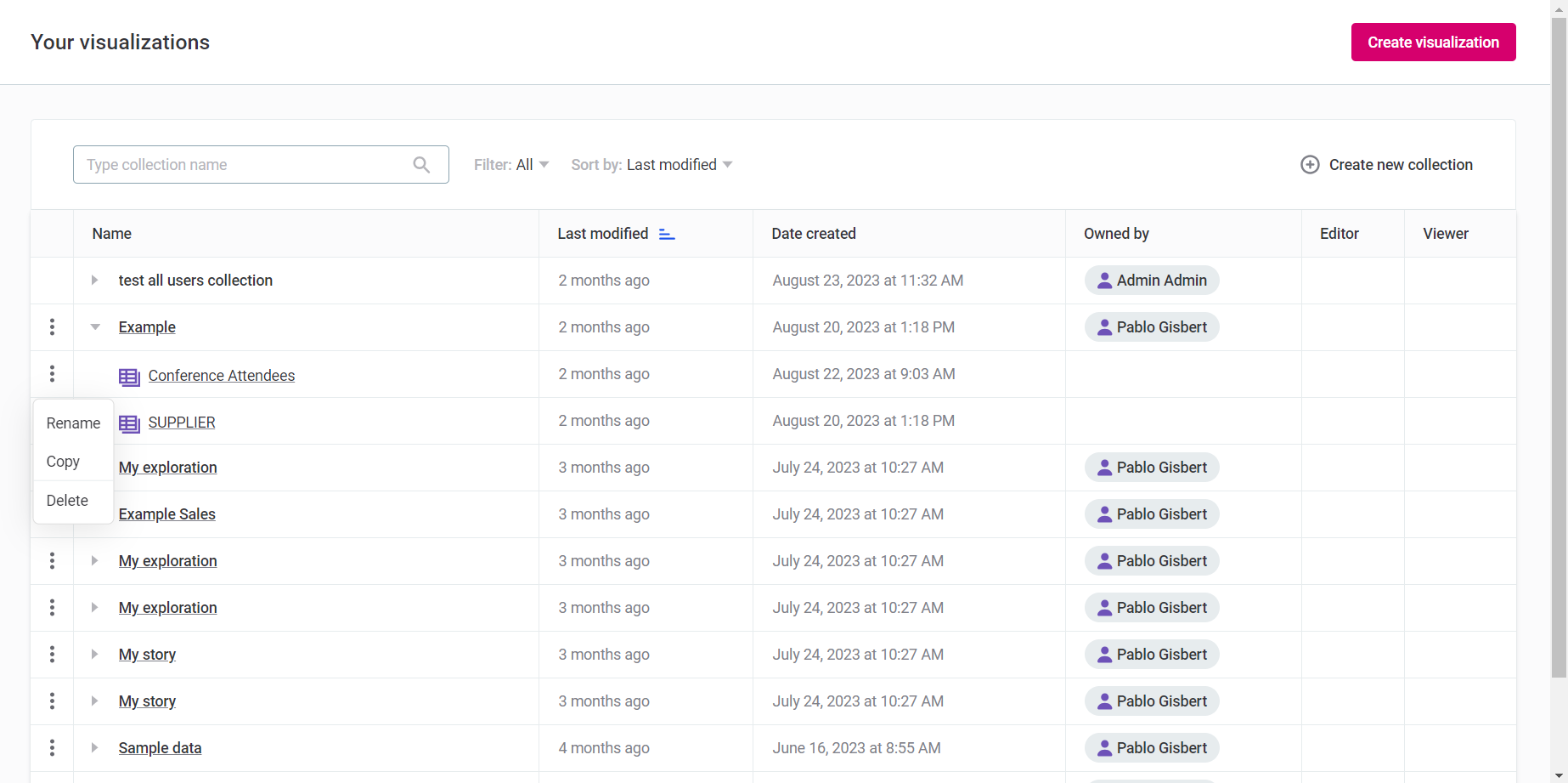
| Use the same three dots menu to rename the visualization as well. |
Delete a visualization
You can delete an existing visualization from Your visualizations screen.
| Once a visualization is removed, it cannot be restored. Proceed with caution. |
-
Locate the visualization in the specific collection.
-
In the three dots menu of the visualization, select Delete and confirm your choice.
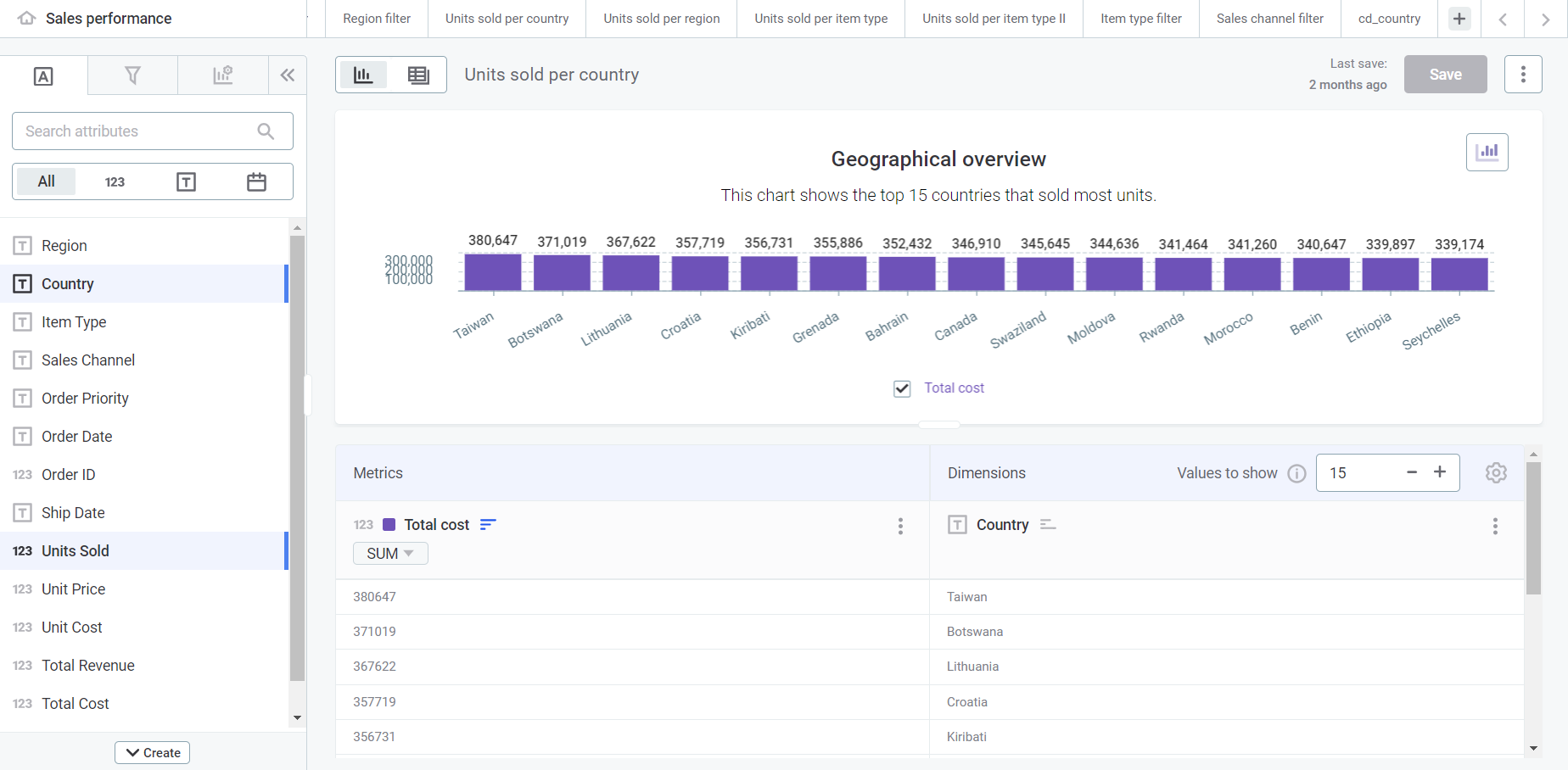
Visualization builder screen
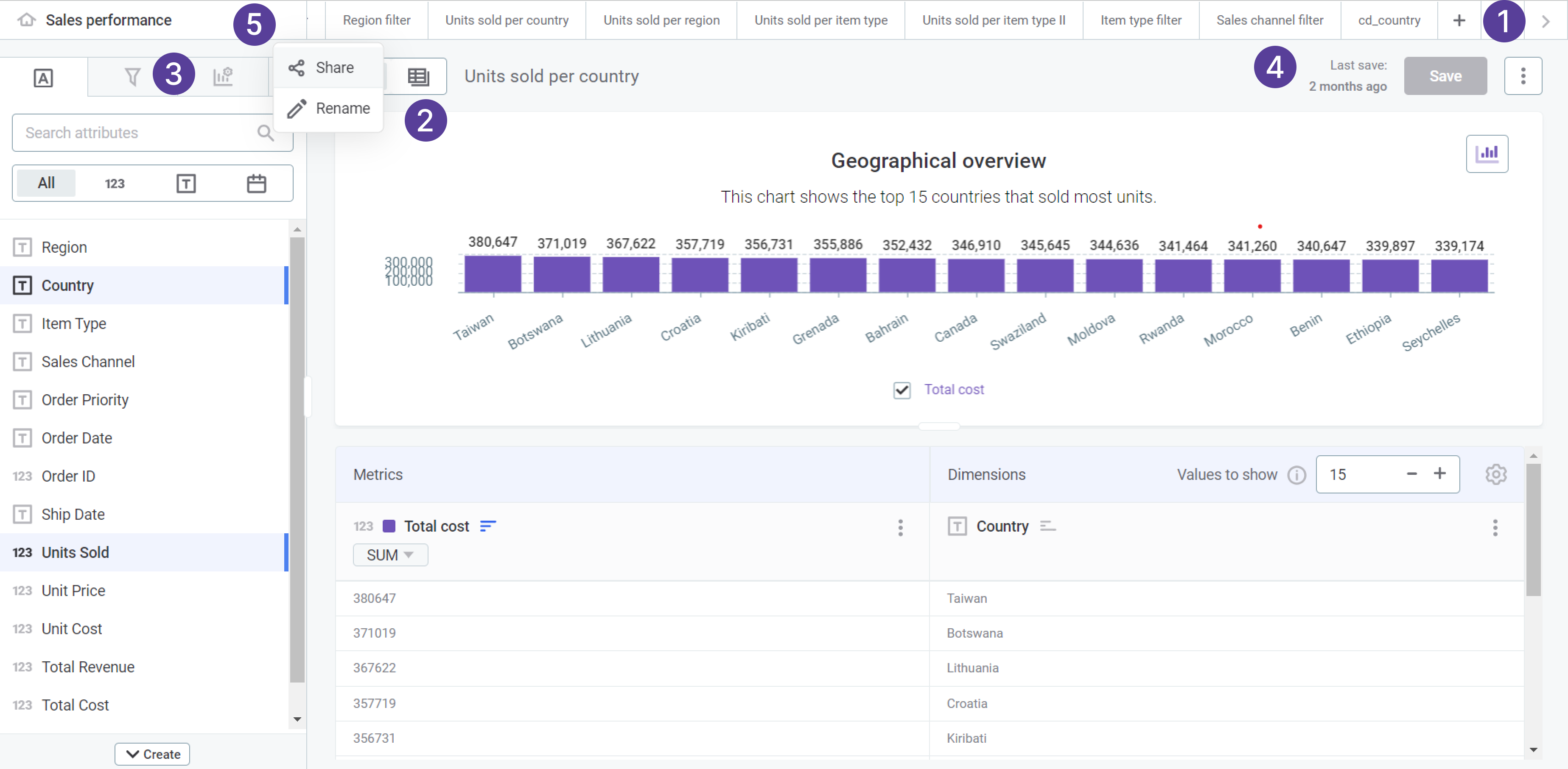
-
Use Tabs ribbon to create, manage, or remove tabs. Tabs allow you to create concurrent visualizations within the same collection.
You can also navigate to the home page to see a display of all your visualizations as cards.
-
Use Data and Visualization toggle to navigate between the Data view (lets you browse the raw data) and Visualization view (lets you build the visualization).
-
Use the left-side menu tabs:
-
Attributes - Allows you to search and identify your preferred attributes and create custom attributes.
-
Filters - Allows you to create custom filters to apply in your visualization.
-
Visualization properties - Allows to customize the look and feel of your visualization.
-
Pinned values tab allows you to save favorite values and create formulas with them.
-
-
Once you are finished building your visualization, select Save to save your visualization.
-
Use Share to make your visualization collaborative or to send it for review to other users or groups.
| For more details about how to build and configure a visualization, see Build a Visualization. |
Tabs
Tabs allow you to create multiple visualizations at once in the same collection. This can be done based on the same or different catalog items.
While you work in multiple tabs, remember that saving one does not automatically save the others. It’s important to navigate to each tab and save the changes separately, ensuring that all updates are retained.
| Drag the tabs within the navigation bar to rearrange their order. |
The Home tab acts as a central dashboard, presenting all your stored visualizations in the collection as cards. From this tab, you can create a new visualization for your collection or modify existing ones.
To manage individual visualizations, hover over the visualization card and use the three dots menu. From here, you can rename, delete, or duplicate the visualization.
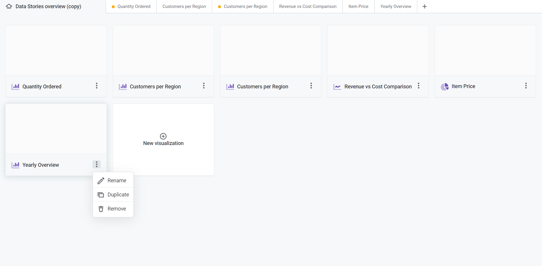
To add more visualizations to your collection while in the visualization builder:
-
Select the plus icon to add more tabs if you want to create other visualizations at the same time.
-
Choose which dataset or catalog item you want to explore. You can select several at once.
The visualization builder allows you to open multiple tabs without extra navigational support. They shrink automatically to fit the navigation bar.
If your open tabs can’t fit in the bar, two navigation arrows display on the right side of the screen to help you navigate through all your open visualizations.
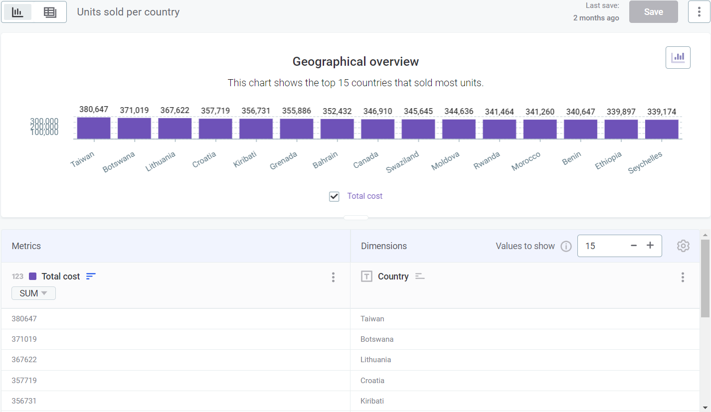
Visualization and Data views
The visualization builder comes with two essential views: Visualization and Data, providing you both with the tools to create custom visualizations and a view of the raw data.
-
Visualization view:
-
Build: Create and assemble different visualizations.
-
Customize: Modify the appearance and layout of the visualizations to align with your needs.
-
-
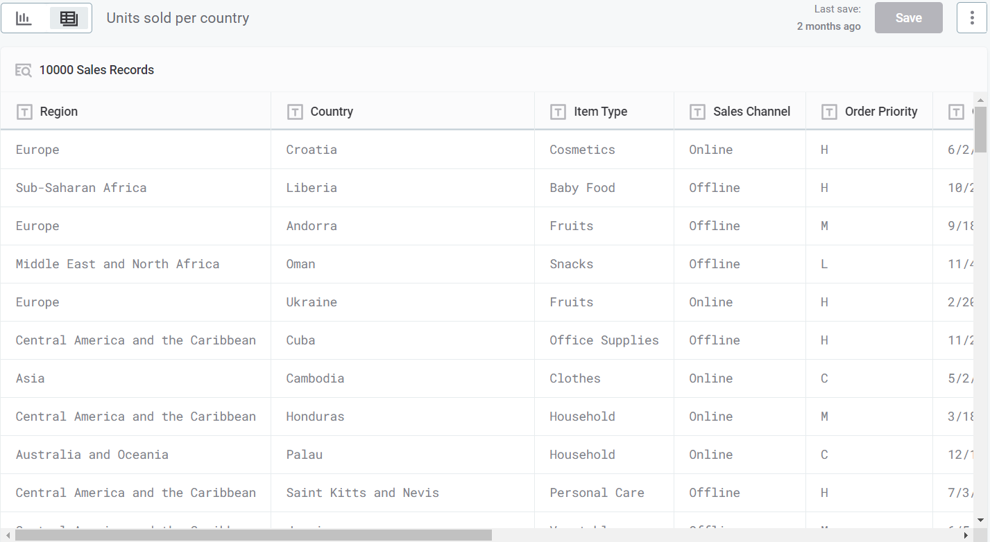
Data view:
-
Browse: See and explore the raw data in a table format.
-
Understand: Gain insights into the details of the dataset or catalog item you selected. Switch between the two views by selecting either the Data or Visualization option.
-
While the Data view offers a straightforward display of all your data in a table, the Visualization view requires some initial customization to determine how this data is presented. You can tailor the visualizations to match your requirements.
| For more information about how to use the Visualization view to build a visualization, see Build a Visualization. |
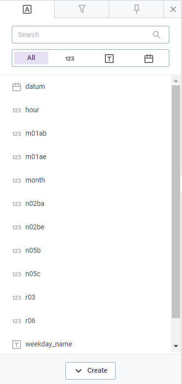
Attributes
Attributes is the main tab in the left-side menu. It displays the names of all columns that are part of the dataset or catalog item.
-
Search for the desired attribute or use the selector toggle under the search bar to filter attributes by:
-
All attribute types.
-
Numeric attribute types.
-
Text attribute types.
-
Date attribute types.
-
-
You can also create custom attributes that are shown separately in the list.
To learn how to create custom attributes, see Create Custom Attributes.
Visualization-specific filters
The Filters tab lets you refine your individual visualizations according to your specific criteria. These filters are then applied in any relevant reports that include these visualizations.
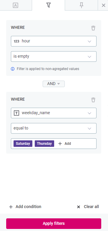
| These filters are specific to each visualization, allowing you to have different filter settings for different visualizations within the same report. |
|
Learn more about the capabilities of Data Stories filters:
|
Visualization properties
The Visualization properties tab is only available once you are in the Visualization view and you have assigned some attributes to Dimensions and/or Metrics columns.
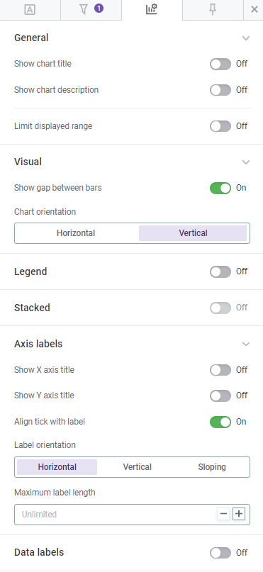
There are several customization options for personalizing visualizations to your requirements.
Depending on the chart of your choice, you can:
-
Adjust colors, fonts, and layouts.
-
Customize axes, legends, and gridlines.
|
Experiment with these settings to create visualizations that resonate with your audience and narrative. For more information, see Visualization Overview. |
Pinned values
The Pinned values tab is available if you’re in the Data view or if no attributes have been assigned yet to Dimensions and/or Metrics columns in the Visualization view.
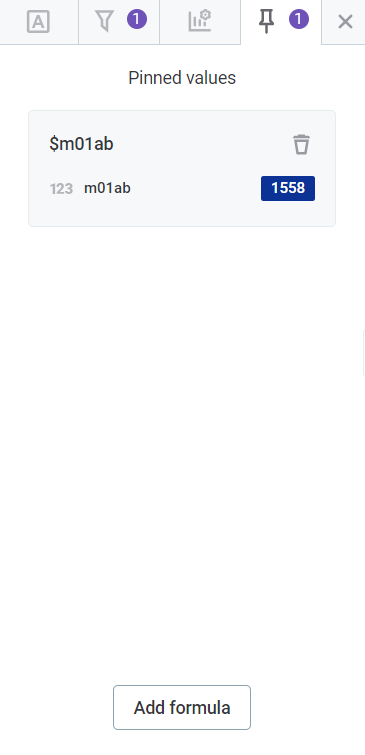
It offers a more advanced way of working with specific data points within your visualizations.
Use pinned values to:
-
Save favorite or frequently used values.
-
Perform calculations or comparisons.
-
Highlight or focus on specific aspects within the visualization.
| To learn more about how to use and manage pinned values in your visualizations, see Pinned Values and Formulas. |
Save your visualization
Once you’ve customized your visualization, select Save.
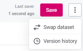
| The last saved timestamp is shown to the left of the Save option. |
|
For additional options, use the three dots menu next to the Save option. This allows you to:
|
Share your collection
If you own the collection where your visualization is stored, you can share it with other users or groups by selecting Share.
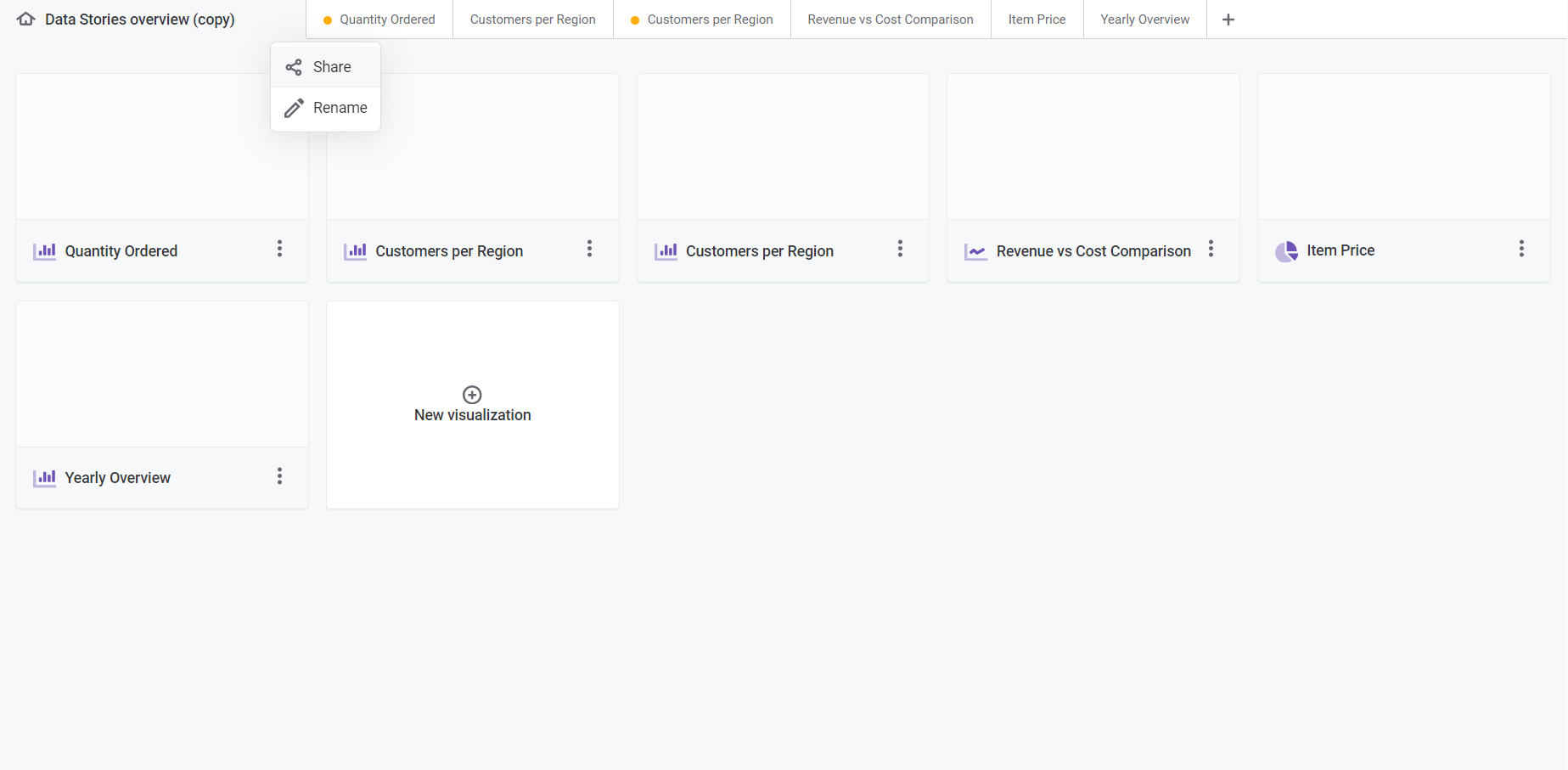
| For a detailed explanation about how to share a collection, see Collections. |
Was this page useful?