
Create a Dashboard
Dashboards are interactive canvases for presenting multiple visualizations together. They display key data points and metrics in a concise and accessible way, helping you gain insights, track KPIs, and make data-driven decisions.
This guide explains how to build dashboards by importing visualizations and static widgets onto a flexible grid canvas.
Create a dashboard
-
Go to ONE Reports > Dashboards and select Create.
This opens a responsive grid layout with a resizable left-side menu containing two tabs: Collections and Widgets.
-
Rename your dashboard by double-clicking the default title (My dashboard) and entering your preferred name.
|
To open an existing dashboard, select the relevant card in ONE Reports > Dashboards. To duplicate an existing dashboard:
|
Add visualizations
You can add multiple visualizations to your dashboard from different collections. For maximum impact, place the most important widgets at the top or in the center.
| ONE Reports leverages data protection classification that prevents unauthorized access to protected data, as signaled by visual indicators (lock icons) and notifications. For more information, see Data Protection in ONE Reports. |
-
On the Collections tab, select the collection where your visualizations are stored.
-
Drag and drop visualizations from the dropdown list to the grid.
-
Resize or rearrange visualizations by dragging the corners or the entire widget within the grid.
To learn more about visualizations, see Manage Visualizations and Collections. |
Add static widgets
Use static widgets such as video, image, or text elements to enrich your dashboard.
-
Select the Widgets tab in the left-side menu.
-
Drag and drop the relevant widget to your dashboard.
-
Customize the widget properties as needed.
|
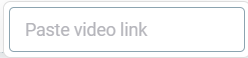
Image widgets
Provide the Image URL and adjust the display using Fill content or Fit content in Image position.
Text widgets
Select the widget to access formatting and customization tools.
| Hover over any button in the toolbar to view helpful tooltips. |
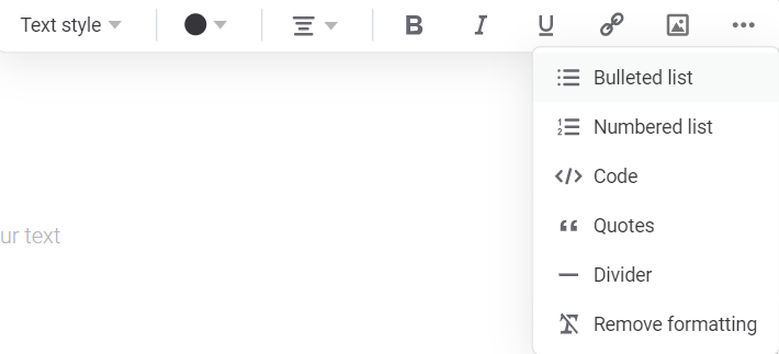
Available options include:
-
Text style: Title, Headline, Paragraph, or Small text.
-
Text color: Choose from the color grid.
-
Text alignment: Left, right, center, or justified.
-
Rich text options: Bold, italic, or underline formatting.
-
Hyperlink: Highlight text and paste a URL.
-
Image URL: Embed images within text.
-
Additional options (…) : List style, code blocks, quotes, dividers, and remove formatting.
-
Undo/Redo: Reverse or restore actions.
Apply global filters
Global filters control the data displayed across your entire dashboard.
| To define filters that apply only to a specific visualization, see Filter Visualization Data. |
Select data source and attributes
-
Select Filter in the upper-right corner of the screen.
-
In Source, choose a dataset from the available datasets in your dashboard.
-
In Attribute, choose an attribute from the list. Recommended attributes are displayed first.
Specify the operation
In Operation, select an operation based on the data type of the chosen attribute.
-
Numeric
-
Text
-
Date
-
>, <, >=, ⇐: Greater than, less than, or equal comparisons.
-
=, ≠: Equal or not equal to a value.
-
is empty, is not empty: Filter by NULL or non-NULL values.
-
in range, not in range: Filter by a numerical range.
-
equal to, not equal to: Match or exclude specific text.
-
contains, does not contain: Match partial text (supports wildcards with
%). -
is empty, is not empty: Filter by NULL or non-NULL values.
-
equal to, not equal to: Match or exclude specific dates.
-
in range, not in range: Filter by a date range.
-
before, after: Filter by dates before or after a specific date.
-
is empty, is not empty: Filter by NULL or non-NULL values.
-
in last: Filter by the last N days, weeks, months, quarters, or years.
-
in current: Filter by the current day, week, month, or year.
Enter values and apply
-
Enter the filter values based on the operation type.
-
Select Apply filters to update the dashboard.
-
To add more filters, select Add filter and repeat the steps.
-
To remove all filters, select Clear all.
|
For each filter, you can:
|
View your dashboard
Select Present in the upper-right corner to switch to a read-only view, ideal for presentations or focused analysis.
| When you select Present, you enter View mode. |
Filter by catalog item or DQ monitor
Use the Catalog items and DQ Monitors filters in the dashboard header to focus on specific data.
-
Catalog items: Select from catalog items included in the dashboard.
-
DQ Monitors: Select from DQ monitors associated with the catalog items. For more information about DQ monitors, see DQ Monitors.
Filter by reference date
Use the Results until filter to view data quality results up to a specific date. This is useful when you want to see a historical snapshot of your data quality metrics rather than the current state.
To filter by reference date:
-
In the dashboard header, select the Results until dropdown.
-
Select a date from the calendar.
The dashboard updates to show results up to and including the selected date.
| The reference date filter and date range picker work together. The date range is calculated from the Results until date, not the current date. For example, if Results until is set to January 7 and you select 7 days on a chart, you see the 7 days leading up to January 7, not the last 7 days from today. |
Filter by date range
Line charts and multiseries line charts can include a date range picker that lets you select how much historical data to display. Available options include All time, 7 days, 14 days, 30 days, Last month, Last 90 days, and Last year.
| The date range picker is only available if it has been enabled in the visualization settings. If you don’t see this option on a chart, contact your administrator or see Line Chart and Line Multiseries Chart to learn how to enable it. |
Save your dashboard
Select Save to save all updates for the current dashboard.
| The last saved timestamp is shown to the left of the Save option. |
Share your dashboard
After saving, you can share your dashboard with others.
| Other users can only view your dashboard if: |
-
You explicitly share it with them.
-
They have permissions to the collection storing the visualizations.
-
They have the appropriate access level to the underlying catalog items or data quality results.
To share a dashboard:
-
Select Share.
-
Find and select the Users or Groups to share with.
-
Set the access level (Edit or View) for each user.
-
Optionally, select Copy Link to copy the dashboard URL.
-
Select Done.
Was this page useful?