
Visualization Settings by Type
This reference describes the available settings and properties for each visualization type in ONE Reports.
| To learn how to create and configure a visualization, see Build a Visualization. |
Bar and Bar Multiseries Charts
Bar Chart displays metrics of a single category, while Bar Multiseries Chart allows you to add a subcategory to the x-axis of a bar chart.
Data and configuration specifics
The number of values to show:
-
Maximum: 10000
-
Recommended: 500
The selected number of rows is taken from the top of the dataset, so it reflects any ordering you might have configured in Ordering.
Visualization sections and properties
-
General:
-
Show chart title: If selected, it allows you to enter a title and have it displayed above the chart. You can also configure how the chart title and description are aligned: center (default), left, or right.
-
Show chart description: If selected, it allows you to enter a description and have it displayed above the chart. You can alter the font color, and define the style as bold, italic, or underline.
-
Limit displayed range: If selected, it allows you to define a range for the metric axis using the fields provided.
-
-
Visual:
-
Show gaps between bars: If not selected, it displays the bars with no spaces in between.
-
Chart orientation: Select whether metrics should be shown on the vertical axis (default), or the horizontal axis.
-
-
Legend: If selected, the legend is displayed and you can choose where it should appear (on the left, bottom, or right of the section).
-
Stacked: If selected, it stacks the chosen metrics. Not available if only one metric has been selected.
-
Stacked to max: Stacks the chosen metrics but first converts the values to a proportion of a whole (1). That is, it changes the values from absolute numbers to a proportional comparison. Not available if only one metric has been selected.
-
-
Axis labels:
-
Show X axis title: If selected, the default X axis title is displayed under the X axis. You can also customize this title in the field provided.
-
Show Y axis title: If selected, the default Y axis title is displayed to the left of the Y axis. You can also customize this title in the field provided.
-
Tick align with label: Select this to align labels to the categories on the chart.
-
Label orientation: Set the orientation of the labels as Horizontal, Vertical, or Sloping.
-
Maximum label length: By default, unlimited. If you enter any other value, it defines the maximum length (number of characters) of each category label.
-
-
Data labels: Select if you want to display labels for the chosen metric values on the chart.
-
Stacked sum label: Only available if there are at least two metrics and the Stacked option is selected. It automatically displays the sum of the two stacked metrics.
-
Label position: If labels are used, choose where they should be displayed: Top or Inside.
-
Bubble Chart
Allows you to track a metric represented by the size of bubbles.
Data and configuration specifics
The number of values to show:
-
Maximum: 10000
-
Recommended: 500
The selected number of rows is taken from the top of the dataset, so it reflects any ordering you might have configured in Ordering.
Visualization sections and properties
-
General:
-
Show chart title: If selected, it allows you to enter a title and have it displayed above the chart. You can also configure how the chart title and description are aligned: center (default), left, or right.
-
Show chart description: If selected, it allows you to enter a description and have it displayed above the chart. You can alter the font color, and define the style as bold, italic, or underline.
-
-
Axis labels:
-
Label orientation: Set the orientation of the labels as Horizontal, Vertical, or Sloping.
-
Maximum label length: By default, unlimited. If you enter any other value, it defines the maximum length (number of characters) of each category label.
-
Category Chart
Category Chart is similar to a bar chart but displays the bars horizontally instead of vertically, with category on the y-axis and metrics on the x-axis.
Data and configuration specifics
The number of values to show:
-
Maximum: 10000
-
Recommended: 500
The selected number of rows is taken from the top of the dataset, so it reflects any ordering you might have configured in Ordering.
Visualization sections and properties
-
General:
-
Show chart title: If selected, it allows you to enter a title and have it displayed above the chart. You can also configure how the chart title and description are aligned: center (default), left, or right.
-
Show chart description: If selected, it allows you to enter a description and have it displayed above the chart. You can alter the font color, and define the style as bold, italic, or underline.
-
Limit displayed range: If selected, it allows you to define a range for the metric axis using the fields provided.
-
-
Visual:
-
Show gaps between bars: If not selected, it displays the bars with no spaces in between.
-
Chart orientation: Select whether metrics should be shown on the vertical axis (default), or the horizontal axis.
-
-
Legend: If selected, the legend is displayed and you can choose where it should appear (on the left, bottom, or right of the section).
-
Stacked: If selected, it stacks the chosen metrics. Not available if only one metric has been selected.
-
Stacked to max: Stacks the chosen metrics but first converts the values to a proportion of a whole (1). That is, it changes the values from absolute numbers to a proportional comparison. Not available if only one metric has been selected.
-
-
Axis labels:
-
Show X axis title: If selected, the default X axis title is displayed under the X axis. You can also customize this title in the field provided.
-
Show Y axis title: If selected, the default Y axis title is displayed to the left of the Y axis. You can also customize this title in the field provided.
-
Tick align with label: Select this to align labels to the categories on the chart.
-
Label orientation: Set the orientation of the labels as Horizontal, Vertical, or Sloping.
-
Maximum label length: By default, unlimited. If you enter any other value, it defines the maximum length (number of characters) of each category label.
-
-
Data labels: Select if you want to display labels for the chosen metric values on the chart.
-
Stacked sum label: Only available if there are at least two metrics and the Stacked option is selected. It automatically displays the sum of the two stacked metrics.
-
Label position: If labels are used, choose where they should be displayed: Top or Inside.
-
Comparison Chart
Displays data as proportionate bars with percentages. For this reason, it is suitable only when you want to display a single metric for a category.
Data and configuration specifics
The number of values to show:
-
Maximum: 5.
The selected number of rows is taken from the top of the dataset, so it reflects any ordering you might have configured in Ordering.
Visualization sections and properties
-
General:
-
Show chart title: If selected, it allows you to enter a title and have it displayed above the chart. You can also configure how the chart title and description are aligned: center (default), left, or right.
-
Show chart description: If selected, it allows you to enter a description and have it displayed above the chart. You can alter the font color, and define the style as bold, italic, or underline.
-
-
Legend: If selected, the legend is displayed and you can choose where it should appear (on the left, bottom, or right of the section).
Donut and Pie Charts
These display data as proportionate slices of a circle. For this reason, they are suitable only when you want to display a single metric for a category.
Data and configuration specifics
The number of values to show:
-
Maximum: 50
The selected number of rows is taken from the top of the dataset, so it reflects any ordering you might have configured in Ordering.
Visualization sections and properties
-
General:
-
Show chart title: If selected, it allows you to enter a title and have it displayed above the chart. You can also configure how the chart title and description are aligned: center (default), left, or right.
-
Show chart description: If selected, it allows you to enter a description and have it displayed above the chart. You can alter the font color, and define the style as bold, italic, or underline.
-
-
Legend: If selected, the legend is displayed and you can choose where it should appear (on the left, bottom, or right of the section).
-
Axis labels:
-
Label position: Choose whether the labels are displayed inside or outside of the section.
-
Gauge Chart
Gauge Chart is available as a visualization type only when you have a single metric configured with no dimensions.
Visualization sections and properties
-
General:
-
Title: Modify the chart title to provide a clear context and description. You can also configure how the chart title is aligned: center (default), left, or right. By default, the name of the metric is used as the title.
-
-
Visual:
-
Progress Bar: If selected, it displays the target customization menu and the target progress in the Gauge Chart. You can add a target and the target percentage using the following fields:
-
Target to reach: Enter the target value. The Gauge chart bar shows the metric value’s proximity to the target.
If the metric value is larger than the actual target value, we recommend reviewing and adjusting the target value to reflect the desired goals.
-
Show target percentage: Select if you want to showcase the percentage of the metric for better orientation in relation to the established target (displayed under the value and progress bar in the chart).
-
Show segments: If selected, the progress bar in a KPI chart is divided into distinct segments, making it easier to track progress towards multiple milestones. Segments are marked by percentages and you can customize their color and completion rate. To add new segments, select Add segment.
-
Heatmap Chart
Allows you to track a metric represented by a specific color.
Visualization sections and properties
-
General:
-
Show chart title: If selected, it allows you to enter a title and have it displayed above the chart. You can also configure how the chart title and description are aligned: center (default), left, or right.
-
Show chart description: If selected, it allows you to enter a description and have it displayed above the chart. You can alter the font color, and define the style as bold, italic, or underline.
-
Limit displayed range: If selected, it allows you to define a range for the metric axis using the fields provided.
-
-
Visual:
-
Invert colors: Invert the selected colorscale (that is, invert the colors representing high and low values).
-
Red-Green colorscale: Switch to a red-green colorscale.
-
Plasma colorscale: Switch to a plasma colorscale.
-
Show colorscale: If selected, a legend with the selected colorscale is displayed. You can also choose the position of the colorscale on the left, bottom, or right of the section.
-
-
Axis labels:
-
Label orientation: Set the orientation of the labels as horizontal, vertical, or sloping.
-
Maximum label length: By default, unlimited. If you enter any other value, it defines the maximum length (number of characters) of each category label.
-
-
Data labels: Select if you want to display labels for the chosen metric values on the chart.
Heatmap Calendar Chart
Represents recurring discrete activities over long periods of time. The chart displays a color for each time period, depending on a specified metric.
Visualization sections and properties
-
General:
-
Show chart title: If selected, it allows you to enter a title and have it displayed above the chart. You can also configure how the chart title and description are aligned: center (default), left, or right.
-
Show chart description: If selected, it allows you to enter a description and have it displayed above the chart. You can alter the font color, and define the style as bold, italic, or underline.
-
-
Visual:
-
Scatter: If selected, the metrics are displayed as a scatter chart embedded in the calendar.
-
Histogram Chart and Histogram Chart with Selection
Displays numerical data by grouping the data points into buckets or ranges of the same width. Each bucket is shown as a bar and the height of each bar reflects the number of data points present in that range.
Data and configuration specifics
The number of buckets to show:
-
Maximum: 30
-
Recommended: Between 10 and 20
If your dataset is very large, it’s likely you will need more buckets. Changes in Ordering affect the order in which your buckets are displayed.
Visualization sections and properties
-
General:
-
Show chart title: If selected, it allows you to enter a title and have it displayed above the chart. You can also configure how the chart title and description are aligned: center (default), left, or right.
-
Show chart description: If selected, it allows you to enter a description and have it displayed above the chart. You can alter the font color, and define the style as bold, italic, or underline.
-
KPI Chart
KPI Chart is available as a visualization type only when you have a single metric configured. There are two variants:
-
KPI: Displays a single metric value.
-
KPI with Target: Displays a metric value along with a target value and the progress towards the target.
Visualization sections and properties
-
General:
-
Title: Modify the chart title to provide a clear context and description. You can also configure how the chart title is aligned: center (default), left, or right.
-
Show widget border: Choose whether to display the widget border in the report. Possible options are none, bottom, or left.
-
-
Visual:
-
Value alignment: Choose the alignment of the metric value (left, center, or right).
-
-
Progress Bar: If selected, it displays the target customization menu and the target progress in the KPI. You can add a target and the target percentage using the following fields:
-
Target to reach: Enter the target value. A progress bar shows the metric value’s proximity to the target.
If the metric value is larger than the actual target value, we recommend reviewing and adjusting the target value to reflect the desired goals.
-
Show target percentage: Select if you want to showcase the percentage of the KPI for better orientation in relation to the established target (displayed under the value and progress bar in the KPI).
-
Show segments: If selected, the progress bar in a KPI chart is divided into distinct segments, making it easier to track progress towards multiple milestones. Segments are marked by percentages and you can customize their color and completion rate. To add new segments, select Add segment.
-
KPI with Comparison Chart
KPI with Comparison Chart is available as a visualization type only when you have two metrics configured. It highlights the difference between the two metrics for comparison purposes.
Visualization sections and properties
-
General:
-
Title: Modify the chart title to provide clear context and description. You can also configure how the chart title is aligned: center (default), left, or right. By default, the name of the metric is used as the title.
-
-
Visual:
-
Value alignment: Choose the alignment of the metric value (left, center, or right).
-
-
Comparison: switch is automatically enabled and cannot be disabled. It displays the comparison customization menu and the target progress in the KPI as long as there are two metrics in the builder.
-
You can configure how the difference between the values is displayed: as a Percentage, as a Value (absolute number) or Both.
-
If the difference is positive, it will be shown in a green badge with a green ascending arrow.
-
If the difference is negative, it will be shown in a red badge with a red descending arrow.
-
-
Line Chart and Line Multiseries Chart
Line Chart displays metrics of a single category, plotted as a line. Line Multiseries allows you to break down your category into subcategories.
Data and configuration specifics
The number of values to show:
-
Maximum: 10000
-
Recommended: 500
The selected number of rows is taken from the top of the dataset, so it reflects any ordering you might have configured in Ordering.
Visualization sections and properties
-
General:
-
Show chart title: If selected, it allows you to enter a title and have it displayed above the chart. You can also configure how the chart title and description are aligned: center (default), left, or right.
-
Show chart description: If selected, it allows you to enter a description and have it displayed above the chart. You can alter the font color, and define the style as bold, italic, or underline.
-
Limit displayed range: If selected, it allows you to define a range for the metric axis using the fields provided.
-
Enable date ranges: If selected, viewers can select a time range when viewing the chart in a dashboard. Available ranges include All time, 7 days, 14 days, 30 days, Last month, Last 90 days, and Last year. This is particularly useful for data quality dashboards where you want viewers to focus on recent trends. See Filter by date range for more information on how viewers use this feature.
-
-
Visual:
-
Filled: If selected, it fills the chosen metrics.
-
Show points: If selected, it displays data points on the chart.
-
Connect points: If enabled, it connects a discontinuous graph into a continuous one even if values are left out. It also automatically turns on the Show points property.
-
Average line bucketing: If selected, it shows the average line on the x-axis calculated from all metrics.
-
Data marklines: If not selected, data marklines disappear from the chart.
-
Global average line: If selected, it displays an average from all the metric data. Not available if only one metric has been selected.
-
Replace undefined values with zero: If selected, a zero is used instead of any missing data points.
-
-
Legend: If selected, the legend is displayed and you can choose where it should appear (on the left, bottom, or right of the section).
-
Axis labels:
-
Show X axis title: If selected, the default X axis title is displayed under the X axis. You can also customize this title in the field provided.
-
Show Y axis title: If selected, the default Y axis title is displayed to the left of the Y axis. You can also customize this title in the field provided.
-
Switch to linear/logarithmic: If selected, it switches the y-axis scale to a logarithmic scale.
-
Switch boundary gap: If selected, this adjusts the x-axis labels to position them in the center of the space between two axis ticks, rather than directly under each tick. This setting improves label readability, especially for longer labels.
-
Label orientation: Set the orientation of the labels as Horizontal, Vertical, or Sloping.
-
Maximum label length: By default, unlimited. If you enter any other value, it defines the maximum length (number of characters) of each category label.
-
Pivot Table
A powerful data analysis tool that allows you to summarize, sort, reorganize, group, count, total, or average data stored in a table. Pivot tables provide a flexible and interactive way to view data from different perspectives by rearranging the rows and columns.
With pivot tables, you can easily analyze large amounts of data, identify patterns, and make comparisons.
Data and configuration specifics
Pivot table is available as a visualization type only when you have at least one dimension and one metric configured. To change the visualization type, select the chart icon in the visualization builder and choose from the available options.
Adding an excessive number of attributes in the Dimensions column can potentially impact performance. There is no limit on the Metrics column.
Dimensions can be sorted only by the leftmost dimension in the Dimensions menu. Metrics can be sorted without limitations.
You can also switch dimensions from columns to rows or vice versa. To do so, select the transposition selector under the Dimension name.
Visualization sections and properties
-
General:
-
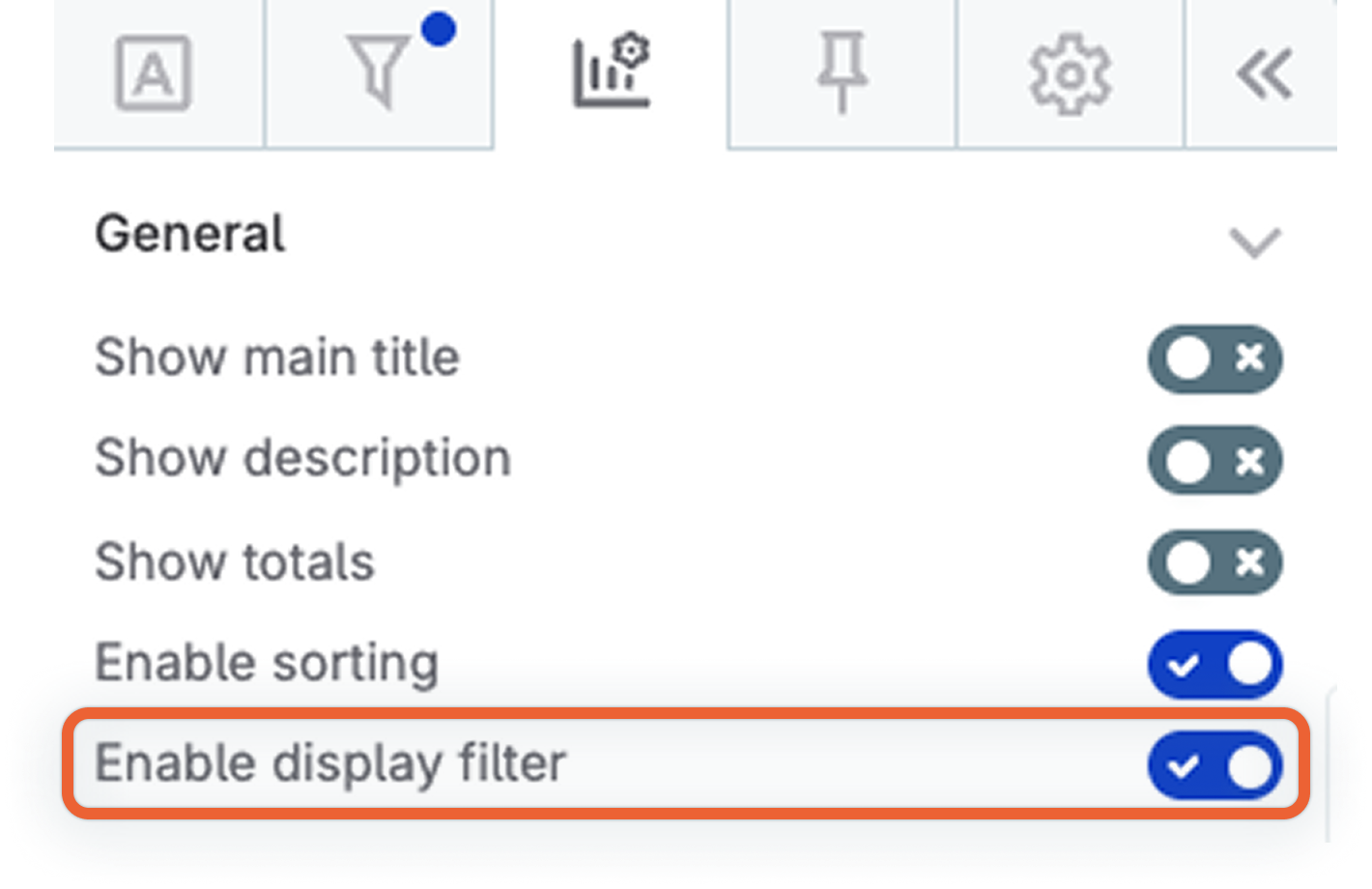
Show main title: If selected, it allows you to enter a title and have it displayed above the table.
-
Show description: If selected, it allows you to enter a description and have it displayed above the table.
-
Show totals: Enable this to display total values at the bottom of the table for data summarization. The values shown in this row depend on the aggregation function and the selected metrics.
-
Enable sorting: Enable this to allow viewers of the table to sort by column as they wish, regardless of what you as the creator sorted it by.
-
Enable display filter: Enable this to allow report viewers to filter the pivot table data themselves. See Display filters for more information.
-
Show trend
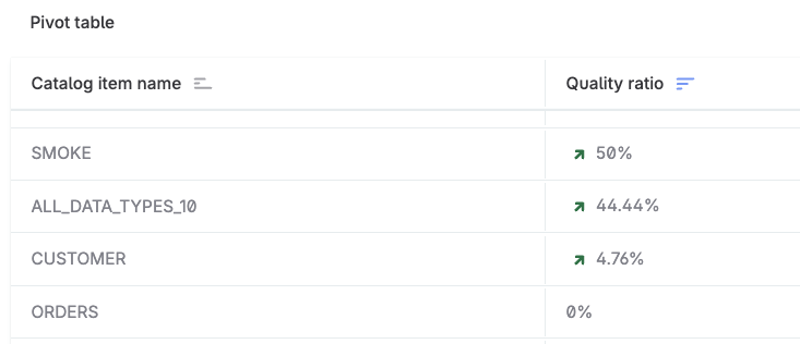
You can display trend indicators on metrics to visualize changes. When enabled, an arrow shows the direction of change:
-
Positive values display a green arrow pointing up.
-
Negative values display a red arrow pointing down.
-
Zero values display no arrow.
This is useful for highlighting changes over time, such as differences between DQ evaluation runs, or for visualizing any metric where positive and negative values indicate direction of change.
To show trends for a metric:
-
In the Metrics section, select the three-dot menu on the metric you want to track.
-
Select Show trend.
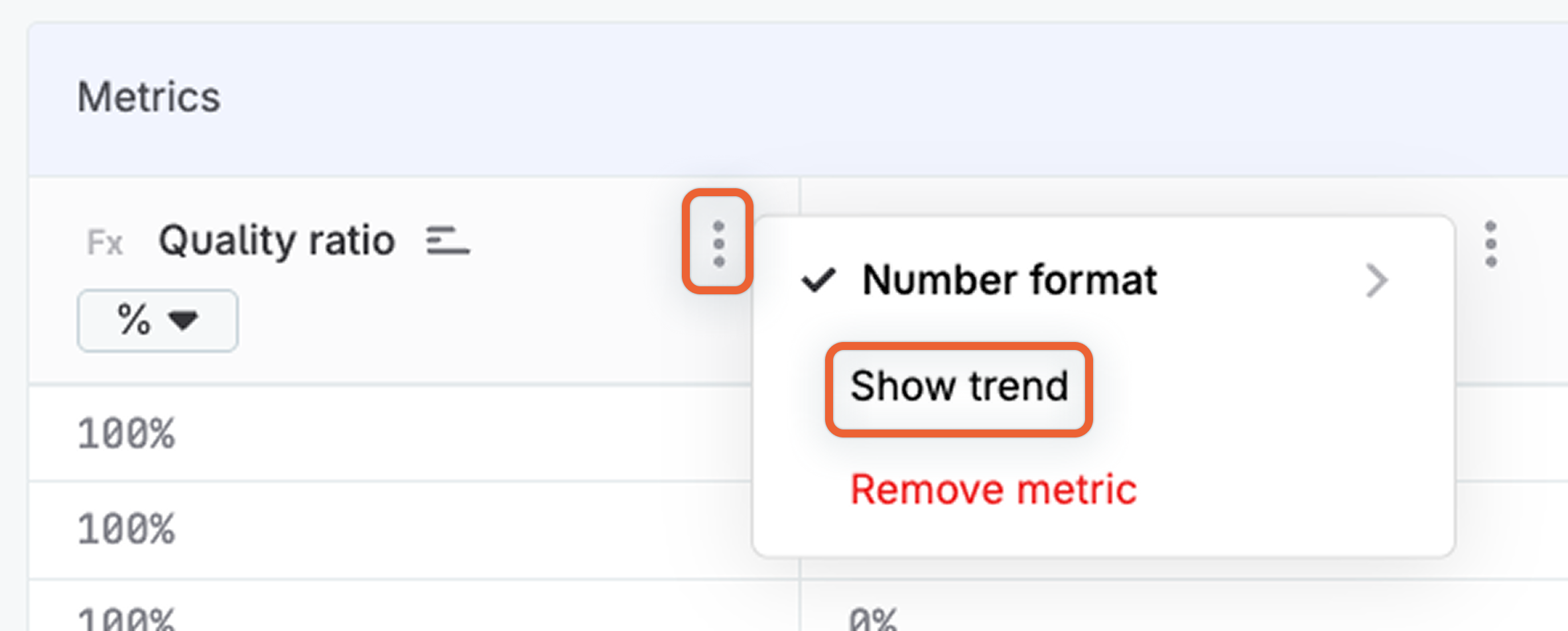
The pivot table now displays trend arrows for that metric.
To hide the trend, select the three-dot menu on the metric and select Hide trend.
Dataset filters vs display filters
Pivot tables support two types of filters, accessible from the Filters tab:
-
Dataset filters define which data is included in the visualization. You select an attribute, an operation, and the actual filter value. These filters are applied by you as the visualization creator and work the same way as filters on other visualization types. You can add multiple conditions and choose whether they are combined using
ANDorORlogic. For more information, see Filter Visualization Data. -
Display filters allow report viewers to refine what is shown in the pivot table. You define only which attributes and operations are available; viewers then set their own filter values when viewing the report. See Display filters to learn how to configure them.
Display filters
Display filters let you give report viewers control over how pivot table data is filtered. You configure which attributes can be filtered and which operations are available; viewers then apply their own thresholds.
| Use display filters for attributes like quality ratio or number of failed records. This enables viewers to focus on the most relevant data without you having to create multiple pre-filtered visualizations. |
To configure display filters:
-
In General settings, enable Enable display filter.
-
Navigate to the Filters tab. You now see two sub-tabs: Dataset Filters and Display Filters.
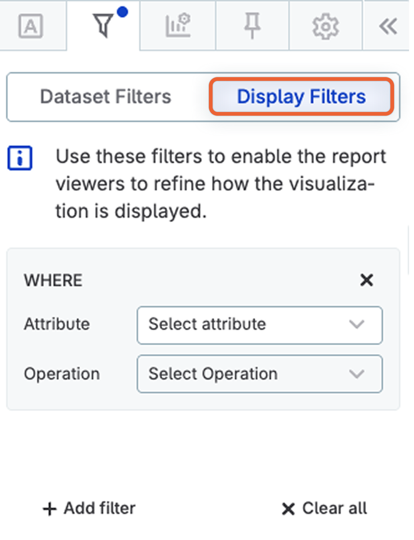
-
Select Display Filters.
-
In Attribute, select the attribute viewers can filter by, for example,
Quality ratio. -
In Operation, select which operation is available, for example,
≤(less than or equal to). -
Use + Add filter to add additional filters.
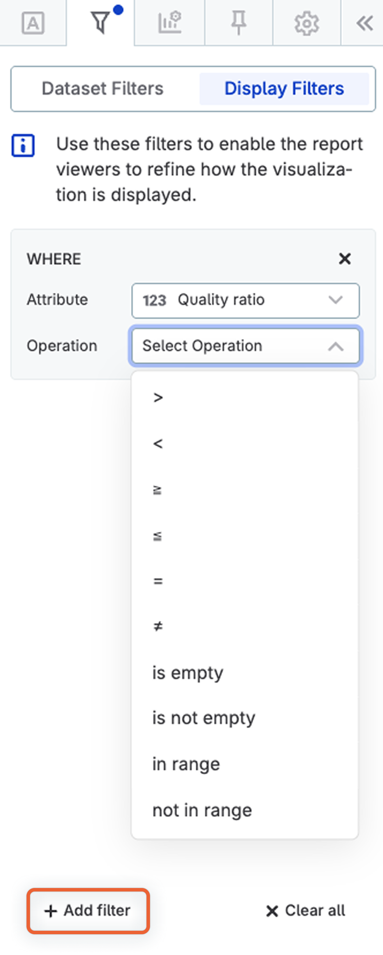
When viewers open the report, they can use the filter controls in the pivot table header to set their own values.
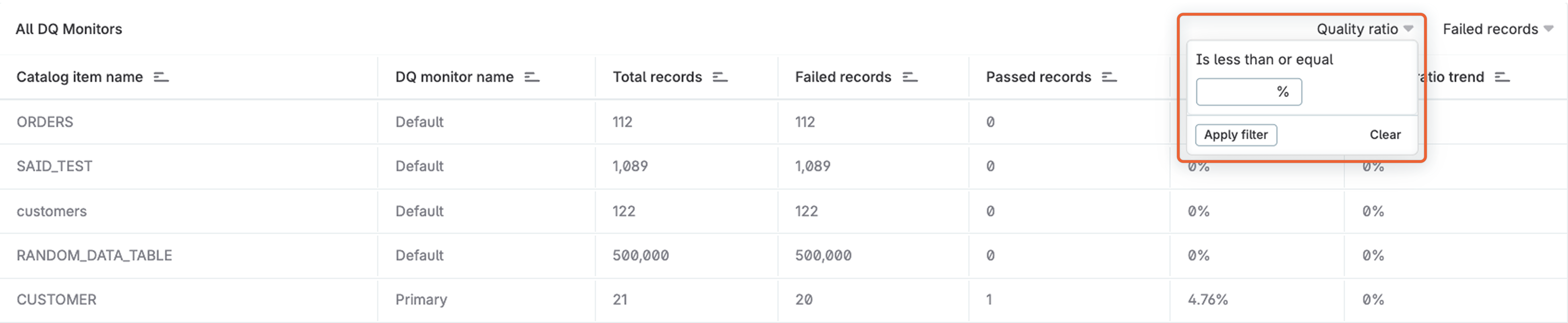
| Totals in the pivot table are calculated based on currently visible data. If a viewer applies a display filter, the totals update to reflect only the filtered results. |
Scatter Chart
Helps visualize the relationship between two categories.
Data and configuration specifics
The number of values to show:
-
Maximum: 10000
-
Recommended: 500
The selected number of rows is taken from the top of the dataset, so it reflects any ordering you might have configured in Ordering.
Visualization sections and properties
-
General:
-
Show chart title: If selected, it allows you to enter a title and have it displayed above the chart. You can also configure how the chart title and description are aligned: center (default), left, or right.
-
Show chart description: If selected, it allows you to enter a description and have it displayed below the title and above the chart. You can alter the font color, and define the style as bold, italic, or underline.
-
-
Axis labels:
-
Label orientation: Set the orientation of the labels as Horizontal, Vertical, or Sloping.
-
Maximum label length: By default, unlimited. If you enter any other value, it defines the maximum length (number of characters) of each category label.
-
Sparkline Chart
A small line chart without axes that is designed to display the general pattern of data rather than exact values.
With a sparkline chart, you should select a category and metric to visualize, and then a subcategory. A separate sparkline is shown per subcategory.
Data and configuration specifics
The number of values to show:
-
Maximum: 30
The selected number of rows is taken from the top of the dataset, so it reflects any ordering you might have configured in Ordering.
Visualization sections and properties
-
General:
-
Show chart title: If selected, it allows you to enter a title and have it displayed above the chart. You can also configure how the chart title and description are aligned: center (default), left, or right.
-
Limit displayed range: If selected, it allows you to define a range for the metric axis using the fields provided.
-
-
Visual:
-
Stacked: If selected, it stacks the chosen metrics. Not available if only one metric has been selected.
-
Replace undefined values with zero: If selected, a zero is used instead of any missing data points.
-
Connect points: If enabled, it connects a discontinuous graph into a continuous one even if values are left out. It also automatically turns on the Show points property.
-
Show maximal value: If selected, it displays the maximum value for the chosen metric next to the subcategory heading.
-
Show minimal value: If selected, it displays the minimum value for the chosen metric next to the subcategory heading.
-
Show last value: If selected, it displays the last value for the chosen metric next to the subcategory heading.
-
Show points: If enabled, it displays data points on the chart.
-
-
Legend:
-
Hide legend: If selected, all labels are hidden.
-
-
Axis labels:
-
Switch to linear/logarithmic: If selected, it switches the y-axis scale to a logarithmic scale.
-
Sparkline Donut Chart
Displays the different attributes of a dimension as donut charts and the selected metrics as proportionate slices of these.
Data and configuration specifics
The number of values to show:
-
Maximum: 50
The selected number of rows is taken from the top of the dataset, so it reflects any ordering you might have configured in Ordering.
Visualization sections and properties
-
General:
-
Show chart title: If selected, it allows you to enter a title and have it displayed above the chart. You can also configure how the chart title and description are aligned: center (default), left, or right.
-
Show chart description: If selected, it allows you to enter a description and have it displayed below the title and above the chart. You can alter the font color, and define the style as bold, italic, or underline.
-
-
Legend: If selected, the legend is displayed and you can choose its position (on the left, bottom, or right of the section). Users can also determine its maximum width.
-
Data labels:
-
Label position: it allows users to set the label position (inside or outside the donut).
-
Spider Chart
Displays a two-dimensional chart of three or more quantitative variables defined as axes that begin from the same point.
Data and configuration specifics
The number of values to show:
-
Maximum: 50
The selected number of rows is taken from the top of the dataset, so it reflects any ordering you might have configured in Ordering.
Visualization sections and properties
-
General:
-
Show chart title: If selected, it allows you to enter a title and have it displayed above the chart. You can also configure how the chart title and description are aligned: center (default), left, or right.
-
Show chart description: If selected, it allows you to enter a description and have it displayed below the title and above the chart. You can alter the font color, and define the style as bold, italic, or underline.
-
-
Visual:
-
Switch indicators: If selected, it swaps the view and displays metrics on X-axis and dimensions on Y-Axis.
-
-
Legend: If selected, the legend is displayed and you can choose where it should appear (on the left, bottom, or right of the section).
Was this page useful?