Welcome to Data Stories
|
Available in Ataccama Cloud deployments only. |
Data Stories is a business intelligence tool that helps you present complex data to your audience using a streamlined and intuitive interface.
It allows you to easily create stunning data visualizations and to explain difficult data phenomena, making it more accessible for everyone. With Data Stories you can present complex facts, combine a multitude of data sources, and impress stakeholders - all with live data.
-
Collections and Visualizations provide comprehensive guidelines on creating, managing, and collaborating on visualizations.
-
Stories and Dashboards contain all the information you need to create, edit, and present your stories or dashboards.
-
Glossary will help you get more familiar with Data Stories.
-
Data Stories 14.5.0 Upgrade Notes outline the upgrade process, detailing each step for migrating and transforming legacy content to the latest version.
Supported data sources
In Data Stories, you can work with ONE catalog items and SQL catalog items, as well as ONE Data tables.
The following data sources and authentication methods are supported:
| Data source | Supported authentication methods |
|---|---|
Amazon Aurora PostgreSQL |
Username and password |
ONE Data |
None needed - internal integration |
PostgreSQL |
Username and password |
Snowflake |
Username and password |
Key terms
-
Reports encompass a diverse range of tools and features to present data in a meaningful and accessible manner. The two types found in Data Stories are:
-
Dashboards - Enable the creation of interactive data visualizations on an infinite grid canvas with a fully customizable layout. Users can import visualizations, arrange them strategically, and enhance them with static widgets such as videos, images, and texts.
Cross-filtering is available for all widgets that share a common data source across the canvas, offering enhanced flexibility.
-
Stories - Offer a dynamic, slide-based approach to data visualization, allowing for multiple views or perspectives of data to be presented sequentially. Users can create interactive stories with both visualizations and static widgets, each slide configured on its own unique grid canvas.
-
-
Collections act as folders where you can group related visualizations. You can then share them with team members or groups, or transfer ownership.
-
Visualizations provide a preliminary analysis that helps you understand the data in your dataset and its characteristics, as well as find patterns in it. The modern and user-friendly interface allows you to build visualizations quickly and with a high level of detail. You can then seamlessly add these visualizations into any type of report.
Data Stories home screen
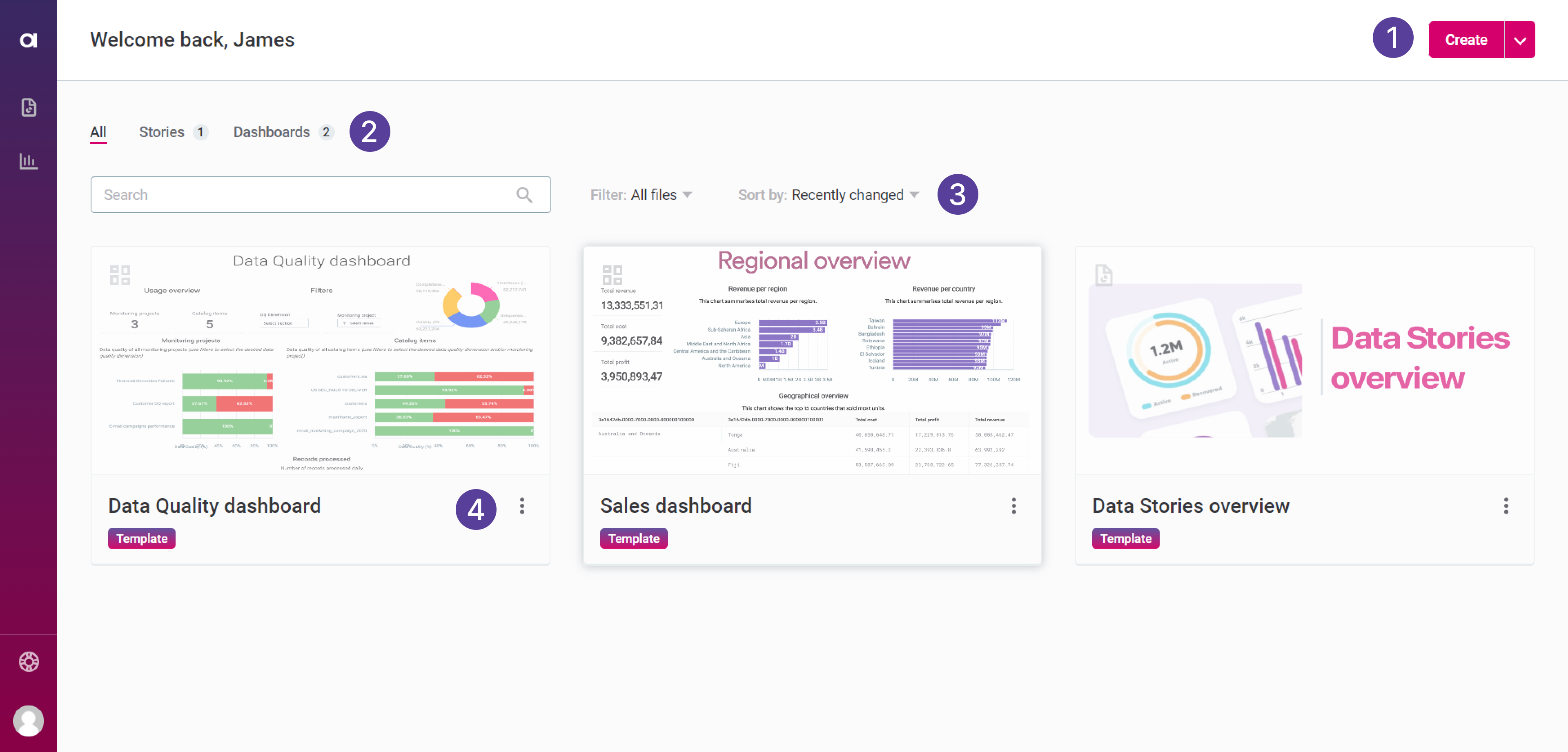
When you first open Data Stories, you land on the home screen.
-
Use the action shortcuts located in the upper-right corner of the screen to create a new report (story or dashboard).
-
Use the tabs (All, Stories, or Dashboards) to view and filter your reports by type.
-
Use the additional filter options to show only your own creations, or reports shared with you.
-
The sorting options allow you to sort the results by date, update, name, or number of views.
-
-
Select a specific report to navigate to the report builder (story or dashboard).
-
Select the three options menu to duplicate or remove your report.
-
| When removing reports, they can’t be restored once you confirm your choice. Proceed with caution. |
Switch languages
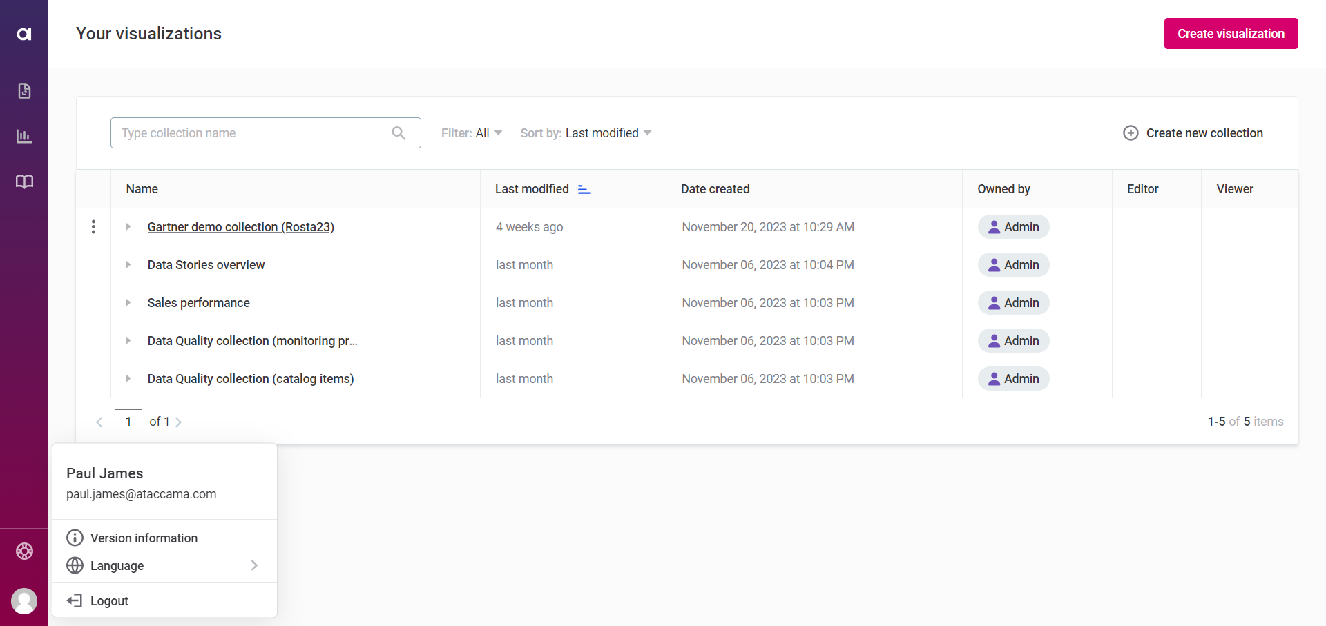
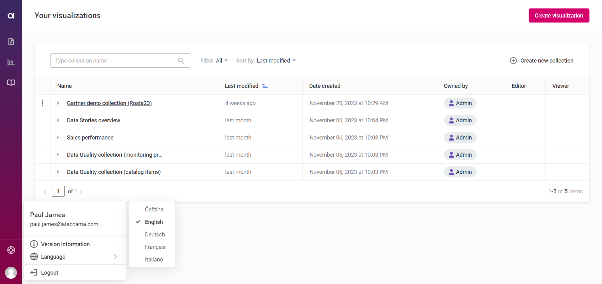
To change the interface language:
-
Select the user icon and then Language.
-
Choose your preferred language from the available options.
Troubleshooting
If you experience any bug or issue when using Data Stories, contact Ataccama Support.
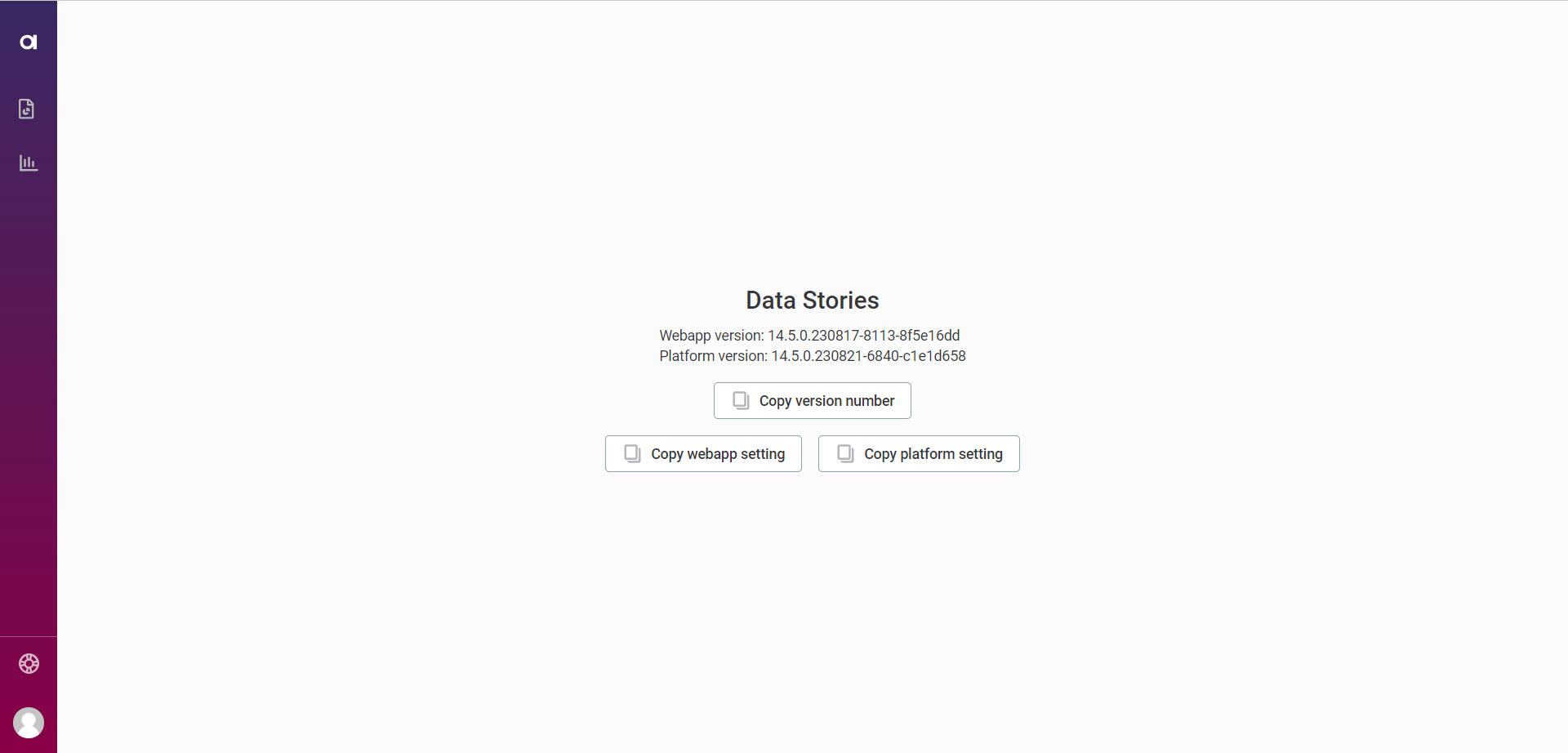
To speed up the troubleshooting and help us investigate, provide more information regarding your application. You can do so by following these steps:
-
Select the user icon in the lower-left corner, and select Version information.

-
Copy the available information and include it in your support request: Version number, Webapp setting, Platform setting.
Was this page useful?
